Class
SegmentedControl
Warning
This item was deprecated in version 2019r2. Please use SegmentedButton as a replacement.
Description
A control that is a horizontal button made up of multiple, independent segments.
Properties
Name |
Type |
Read-Only |
Shared |
|---|---|---|---|
✓ |
|||
✓ |
|||
✓ |
|||
SegmentedControlSegment |
|||
✓ |
|||
✓ |
|||
✓ |
|||
✓ |
|||
SegmentedControlSegment |
|||
✓ |
|||
✓ |
Methods
Name |
Parameters |
Returns |
Shared |
|---|---|---|---|
FileType As String |
|||
Type As String |
|||
[EraseBackground As Boolean] |
|||
eraseBackground As Boolean |
|||
Events
Name |
Parameters |
Returns |
|---|---|---|
itemIndex As Integer |
||
HitItem As MenuItem |
||
x As Integer, y As Integer, obj As DragItem, Action As Integer |
||
Key As String |
||
Key As String |
||
X As Integer, Y As Integer, DeltaX As Integer, DeltaY As Integer |
||
Property descriptions
SegmentedControl.Active
Active As Boolean
Indicates whether the RectControl is active.
This property is read-only.
Active is False when the RectControl's window is not in the foreground. When a Window is deactivated, its controls are automatically deactivated unless RectControl.AllowAutoDeactivate is set to False.
SegmentedControl.Enabled
Enabled As Boolean
Determines if the control should be enabled when the owning window is opened.
A disabled control cannot be clicked and cannot receive the focus.
This example disables the control. Its caption is grayed out.
Me.Enabled = False
SegmentedControl.Handle
Handle As Integer
Returns a handle to the control.
This property is read-only.
For interfacing with Mac APIs using Declare).
On Windows returns the HWND of the control.
On Linux it returns a GtkWidget.
The following gets a handle to the control.
Var i As Integer = Me.Handle
SegmentedControl.Height
Height As Integer
The height (in points) of the control.
This example sets the height of the control to 100:
Me.Height = 100
SegmentedControl.Index
Index As Integer
If the control is used in a control set, this specifies the control's index in the set.
This property is read-only.
The control set is often used to manage a group of RadioButtons since a single RadioButton in a window doesn't make much sense. Most typically, you create an instance of the RadioButton, assign 0 to its Index property, and then duplicate it. This increments the value of Index for each new instance but retain the original control's name.
To determine which RadioButton the user clicked, use the Action event handler of the control set. The parameter Index contains the value of Index for the RadioButton that was clicked. The event handler is this:
Sub Action(Index As Integer)
  Label1.Text = "You chose radio button " + index.ToString + "."
End Sub
To set a RadioButton in a control set, you use its Index property to refer to the RadioButton whose value you want to set. For example, the following line selects the second RadioButton from code:
RadioButton1(1).Value = True ' 0-based
SegmentedControl.Items
Items As SegmentedControlSegment
The array of segments in the SegmentedControl. The array is zero-based.
Use this property to change the properties of each Segment in the SegmentedControl.
When checking the number of segments you must use syntax like:
SegmentedControl1.Items.Ubound
as
UBound(SegmentedControl1.Items)
will not compile.
This code loops through all the segments and changes their Titles:
Dim segment As SegmentedControlItem
For position As Integer = 0 To SegmentedControl1.Items.Ubound
  segment = SegmentedControl1.Items(position)
  segment.Title = Str(position)
Next
This code adds a new segment and then resizes all the segments so that they are visible:
Dim seg As New SegmentedControlItem
seg.Title = "Seg " + Str(SegmentedControl1.Items.Ubound + 1)

SegmentedControl1.Items.Append(seg)

' Resize all the segments
For i As Integer = 0 To SegmentedControl1.Items.Ubound
  Dim item As SegmentedControlItem = SegmentedControl1.Items(i)
  item.Width = SegmentedControl1.Width / (SegmentedControl1.Items.Ubound + 1) - 2
Next
SegmentedControl.Left
Left As Integer
The left side of the control in local coordinates (relative to the window).
The following example moves the control 100 points from the left side of the window:
Me.Left = 150
SegmentedControl.LockBottom
LockBottom As Boolean
Determines whether the bottom edge of the control should stay at a set distance from the bottom edge of the parent control, if there is one, or the owning window.
This property can be set in the control's Inspector. The following example sets it in code.
Me.LockBottom = True
SegmentedControl.LockLeft
LockLeft As Boolean
Determines whether the left edge of the control should stay at a set distance from the left edge of the parent control, if there is one, or the owning window.
Beginning with version 2009r5, LockLeft and Locktop default to True when you add a new control to a window. Existing controls will be altered only if LockRight and/or LockBottom are not set. LockLeft has no effect unless LockRight is True.
This property can be set in the control's Inspector. The following example sets it in code.
Me.LockLeft = True
SegmentedControl.LockRight
LockRight As Boolean
Determines whether the right edge of the control should stay at a set distance from the right edge of the parent control, if there is one, or the owning window.
This property can be set in the control's Inspector. The following example sets it in code.
Me.LockRight = True
SegmentedControl.LockTop
LockTop As Boolean
Determines whether the top edge of the control should stay at a set distance from the top edge of the parent control, if there is one, or the owning window.
Beginning with version 2009r5, LockTop and LockLeft default to True when you add a control to a window. Existing controls will be altered only if LockRight and/or LockBottom are not set. LockTop has no effect unless LockBottom is True.
This property can be set in the control's Inspector. The following example sets it in code.
Me.LockTop = True
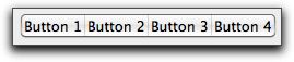
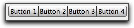
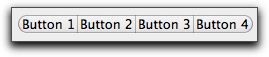
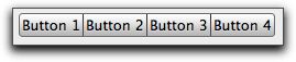
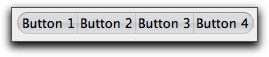
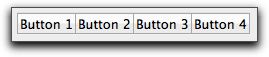
SegmentedControl.MacControlStyle
MacControlStyle As Integer
Controls the appearance of the SegmentedControl on macOS.
Use the following integers:
Value |
Description |
|---|---|
0 |
Automatic |
1 |
Capsule |
2 |
Round Rect |
3 |
Rounded |
4 |
Textured Rounded |
5 |
Textured Square |
6 |
Small Square |
Here are illustrations of each button style.
Automatic

Capsule
Round Rect
Rounded
Textured Rounded
Textured Square
Small Square
This code is in the Open event of the control and the platform is set to Cocoa in the Build Settings dialog. It sets the style to Rounded.
Me.MacControlStyle = 3
SegmentedControl.MouseCursor
MouseCursor As MouseCursor
The cursor to be displayed while the mouse is within the control and both the DesktopApplication and Window class's MouseCursor properties are Nil.
If the DesktopApplication class's MouseCursor property is not Nil or the Window's MouseCursor property is not Nil, then any control's MouseCursor property is ignored. You can use a cursor stored in the Cursors module. On Macintosh, you can also obtain a MouseCursor from a resource file.
This line in the Open event of the control sets the default cursor to the finger pointer.
Me.MouseCursor = System.Cursors.FingerPointer
SegmentedControl.MouseX
MouseX As Integer
The X coordinate of the mouse (points). Measured from the top-left corner of the control.
This property is read-only.
This code is in the MouseDown event of a TextField and displays the X-coordinate at the point of the MouseDown event.
Me.Value = Str(Me.MouseX)
SegmentedControl.MouseY
MouseY As Integer
The Y coordinate of the mouse (points). Measured from the top-left corner of the control.
This property is read-only.
This code is in the MouseDown event of a TextField and displays the Y-coordinate at the point of the MouseDown event.
Me.Value = Str(Me.MouseY)
SegmentedControl.Name
Name As String
The name of the control. Set the name of the control in the Inspector.
This property is read-only.
SegmentedControl.PanelIndex
PanelIndex As Integer
If the control has been placed on a TabPanel or PagePanel control, this is the panel (page/tab) that the control is on. If the control is not on a panel, it returns -1.
The first panel is numbered zero. If the control has been placed on a panel of a TabPanel or PagePanel control, it returns the panel number. If the control is not on a PagePanel or TabPanel, it returns -1. If you change the PanelIndex to a nonexistent panel, the control will disappear until you give it a PanelIndex value that corresponds to a panel that exists.
If you are looking to change the currently selected panel (page/tab), use PagePanel.SelectedPanelIndex.
This code displays the panel index of the control that is on the page.
Label3.Value = Str(Me.PanelIndex)
SegmentedControl.Parent
Parent As Control
Used to get and set the control's parent control or window.
Returns Nil if the parent is the window. Assign Nil to make the control's parent the window, even if it is enclosed by another control. The child control's behavior in the IDE will reflect the parent's state. If the parent control is somehow in another window, an InvalidParentException will occur.
The following example sets the parent of the control to the window.
Me.Parent = Nil
SegmentedControl.Scope
Scope As Integer
Used to determine whether access to the control is Public (0) or Private (2). The default is Public.
This property is read-only.
If the Scope of a control is set to Private, it cannot be accessed from outside its parent window.
SegmentedControl.Segments
Segments As SegmentedControlSegment
Segments is a Design-Time property that is used to created and edit individual segments.
Click the Edit button next to Segments in the Inspector to display the SegmentedControl Editor which you can use to add, remove, reorder, or edit segments. Use the Select checkbox to choose the segment that will be selected by default. In the illustration below, the second segment is selected by default. You can rename a segment by clicking twice on an existing segment to make it editable.
SegmentedControl.SelectionType
SelectionType As Integer
Controls the number of segments that can be selected at the same time.
Value |
Meaning |
Description |
|---|---|---|
0 |
Single |
The SegmentedControl behaves as a group of RadioButtons. One one is selected, the others are automatically deselected. |
1 |
Multiple |
The buttons behave as a series of Checkboxes. Two or more can be selected at the same time. |
2 |
None |
Each button behaves like a PushButton. When a segment is clicked, it is depressed (highlighted) only for the duration of the click. |
SegmentedControl.TabIndex
TabIndex As Integer
The RectControl's position in the Tab Order. It is 0-based. A TabIndex of 0 is the first RectControl to get the focus.
On the Mac you need Full Keyboard Access turned on in System Preferences (Keyboard->Shortcuts) in order to manually set focus to non-text controls.
This example sets the control's TabIndex.
Me.TabIndex = 2
SegmentedControl.Tooltip
Tooltip As String
Text of help message displayed as a Windows or Linux "tooltip" or macOS help tag.
The tip/tag is displayed when the user hovers the mouse cursor over the control.
This example adds a tooltip to a BevelButton that has an icon.
Me.CaptionAlignment = 0 ' left
Me.CaptionDelta = 10
Me.Tooltip = "Click to bark."

Me.Icon = Woof ' added to the project
Me.CaptionPosition = 2
SegmentedControl.Transparent
Transparent As Boolean
Determines whether the control is transparent on Windows. The default is False. Has no effect on macOS or Linux.
Transparent controls draw more slowly and use more memory in order to cache the background. Unless you absolutely require transparency, leave this set to False.
For projects that were created prior to 2018r1, this property defaults to True to emulate previous behavior. Consider changing it to False to improve performance if you do not require transparency.
SegmentedControl.TrueWindow
TrueWindow As Window
Returns a reference to the actual enclosing Window.
This property is read-only.
TrueWindow walks up the window hierarchy and finds the actual enclosing window regardless of how deeply nested the RectControl or DesktopContainer hierarchy is.
Window also has a TrueWindow property.
This example accesses the TrueWindow and displays its Title property in a TextField.
TextField1.Text = Me.TrueWindow.Title
SegmentedControl.Visible
Visible As Boolean
Determines whether the control is visible when its owning window is opened. The default is True: the control is visible.
The following code in the DisclosureTriangle Action event handler displays or hides a ListBox on the window:
ListBox1.Value = Me.Visible
SegmentedControl.Width
Width As Integer
The width (in points) of the control.
The following example resizes the control:
Me.Width = 200
SegmentedControl.Window
Window As Window
The control's parent window.
This property is read-only.
This code gets the parent window's Title property.
TextField1.Text = Me.Window.Title
Method descriptions
SegmentedControl.AcceptFileDrop
AcceptFileDrop(FileType As String)
Permits documents of type FileType to be dropped on the control. FileType must be a file type that you defined in via the FileType class or the File Type Sets Editor.
This code in the Open event of an ImageWell makes it possible for the user to drop either a picture or a file that is a jpeg image. The File Type Sets editor was used to define the “image/jpeg” file type. It is one of the “Common File Types” that is available in the editor.
Me.AcceptPictureDrop
Me.AcceptFileDrop("image/jpeg")
To restrict file drops to just folders (and not files), you can put this code in the DragEnter event:
If Not obj.FolderItem.IsFolder Then Return True
SegmentedControl.AcceptPictureDrop
AcceptPictureDrop
Permits pictures to be dropped on the control.
If a control should accept pictures in a drag and drop, then AcceptPictureDrop needs to be called prior to the drop. Typically, it is in the Open event of the control itself. For example, the line:
Me.AcceptPictureDrop
in the Open event of the control that will receive the dragged pictures is needed. When the picture is dropped, the DropObject event is called and this is where you will put your code to handle the drop.
Canvas.Open:
Me.AcceptPictureDrop
Canvas.DropObject:
If obj.PictureAvailable Then
  Me.Backdrop = obj.Picture
End If
SegmentedControl.AcceptRawDataDrop
AcceptRawDataDrop(Type As String)
Permits data (of the Type specified) to be dropped on the control.
The following specfies a generic file type defined in the File Type Sets editor.
Me.AcceptRawDataDrop("????")
SegmentedControl.AcceptTextDrop
AcceptTextDrop
Permits text to be dropped on the control.
This line in the Open event of a control that can accept dragged text.
Me.AcceptTextDrop
SegmentedControl.Close
Close
Closes a control.
Closing a control permanently removes the control from memory, making it impossible to access. You can close both non-indexed controls and indexed controls. When you close an indexed control, the indexes for the remaining controls will shift downward so that the indexes start with zero and are consecutive.
The following code closes the control. When this is executed from a visible control, the control disappears from the window.
Me.Close
SegmentedControl.DrawInto
DrawInto(g As Graphics, x As Integer, y As Integer)
Draws the contents of the RectControl into the specified Graphics context. The parameters x and y are the coordinates of the top, left corner.
This method does not work with HTMLViewer and OpenGLSurface.
This example draws the current control into the Graphics of a Picture and then displays it as the Backdrop of a Canvas:
Var p As New Picture(Me.Width, Me.Height)
Me.DrawInto(p.Graphics, 0, 0)
Canvas1.Backdrop = p
SegmentedControl.Invalidate
Invalidate([EraseBackground As Boolean])
Similar to RefreshRect, but causes the specified region of the RectControl to be marked dirty and to be redrawn when the window contents need to be redrawn. The region to be redrawn is specified by the X, Y, Width, and Height parameters. This form of Invalidate was formerly called InvalidateRect.
The following code refreshes the control. EraseBackground defaults to True.
Me.Invalidate(False)
SegmentedControl.Refresh
Refresh(eraseBackground As Boolean)
Repaints the portion specified of the contents of the control immediately.
Calling this frequently can cause the code executing to slow down. It is often preferable to call RectControl.Invalidate instead.
Refresh the entire area:
Me.Refresh(False)
Refresh a portion of the area:
Me.Refresh(100, 150, 200, 300)
SegmentedControl.SetFocus
SetFocus
If applicable, sets the focus to the RectControl. KeyDown events are directed to the control.
If the control cannot get the focus on the platform on which the application is running, SetFocus does nothing. The SetFocus method of the Window class or the ClearFocus method can be used to remove the focus from the control that currently has the focus, leaving no control with the focus.
On the Mac you need Full Keyboard Access turned on in System Preferences (Keyboard->Shortcuts) in order to manually set focus to non-text controls.
The following example sets the focus to TextField1. If another control has the focus when this line is executed, then the user sees that TextField1 gets the focus.
TextField1.SetFocus
SegmentedControl.SizeToFit
SizeToFit
Sizes the control to fit into its space, increasing or decreasing its width as necessary. Use this after making changes to the Segment width.
If you add a new segment, the SegmentedControl does not resize to fit it so you need to call SizeToFit:
' Add a new segment
Dim seg As New SegmentedControlItem
seg.Title = "Seg " + Str(SegmentedControl1.Items.Ubound + 1)
SegmentedControl1.Items.Append(seg)

SegmentedControl1.SizeToFit
If you need to keep the SegmentedControl width the same then you will want to resize the individual segments to fit within the SegmentedControl width. Refer to the SegmentedButton.SegmentAt method for an example on how to do that.
This example demonstrates how to dynamically change a SegmentedControl's properties on the fly. For example, this code on a PushButton increases the size of the selected segment. The code cycles through all the segments and increases the size of each segment that is selected. The loop creates an instance of a Segment for each segment, tests whether it is selected using the Selected property, and then increases the width for only the selected ones. This will increase the overall width of the SegmentedControl:
' count down to avoid re-evaluating the Ubound all the time
For i As Integer = SegmentedControl1.Items.Ubound DownTo 0

  ' get the reference to the segment
  Dim s As SegmentedControlItem = SegmentedControl1.Items(i)

  ' see if the segment was selected
  If s.Selected Then
    ' it is selected so increase this segment in size
    s.Width = s.Width + 10
  End If
Next

' make sure the segmented control knows to resizes its drawing boundaries or you can get weird effects
SegmentedControl1.SizeToFit
Event descriptions
SegmentedControl.Action
Action(itemIndex As Integer)
One of the buttons was clicked or otherwise activated.
Test the itemIndex to determine which segment was clicked:
If itemIndex = 0 Then
  ' Do something
Else
  ' Do something
End If
SegmentedControl.Close
Close
The control is about to close.
SegmentedControl.ConstructContextualMenu
ConstructContextualMenu(Base As MenuItem, x As Integer, y As Integer) As Boolean
This event is called when it is appropriate to display a contextual menu for the control.
This event handler is the recommended way to handle contextual menus because this event figures out whether the user has requested the contextual menu, regardless of how they did it. Depending on platform, it might be in the MouseUp or MouseDown event and it might be a right+click or by pressing the contextual menu key on the keyboard, for example.
Base is analogous to the menu bar for the contextual menu. Any items you add to Base will be shown as menu items. If you return False, the event is passed up the parent hierarchy.
If you return True, the contextual menu is displayed. The parameters x and y are the mouse locations. If the event was fired because of a non-mouse event, then x and y are both set to -1. See the example of a contextual menu in the following section.
The following ConstructContextualMenu event handler builds a menu with three menu items plus a submenu with three additional menu items.
' Add some items
base.AddMenu(New MenuItem("Test 1"))
base.AddMenu(New MenuItem("Test 2"))
base.AddMenu(New MenuItem("Test 3"))

' Add a Separator
base.AddMenu(New MenuItem(MenuItem.TextSeparator))

' Add a sub menu
Var submenu As New MenuItem("SubMenu")
submenu.AddMenu(New MenuItem("SubMenu Test 1"))
submenu.AddMenu(New MenuItem("SubMenu Test 2"))
submenu.AddMenu(New MenuItem("SubMenu Test 3"))
base.AddMenu(submenu)

' Add a Separator
base.AddMenu(New MenuItem(MenuItem.TextSeparator))

Return True
SegmentedControl.ContextualMenuAction
ContextualMenuAction(HitItem As MenuItem) As Boolean
Fires when a contextual menuitem hitItem was selected but the Action event and the MenuHandler for the menuitem did not handle the menu selection.
This event gives you a chance to handle the menu selection by inspecting the menuitem's Text or Tag properties to see which item was selected. Use this in conjunction with ConstructContextualMenu if you have not specified the Action event or the Menu Handler for the items on the contextual menu. See the example of a contextual menu in the examples for the RectControl class.
Return True if this event has handled the item the user chose from the contextual menu. Returning False will cause the control's parent to execute its ContextualMenuAction event. This can be handy if you have the same contextual menu for several controls who share the same Parent (several on the same window for example). By returning False you can handle them all in a single event.
This simple event handler displays the value of the selected menu item.
If hitItem <> Nil Then MessageBox(hitItem.Value)
Return True
SegmentedControl.DragEnter
DragEnter(obj As DragItem, Action As Integer) As Boolean
Fires when the passed DragItem enters the RectControl.
Returns a Boolean. Return True from this event to prevent the drop from occurring.
The Action parameter specifies the drag action. It can take the following class constants of the DragItem class:
Value |
Class Constant |
|---|---|
0 |
DragItem.DragActionDefault |
1 |
DragItem.DragActionCopy |
2 |
DragItem.DragActionMove |
3 |
DragItem.DragActionLink |
To restrict file drops to just folders (and not files), you can put this code in the DragEnter event:
If Not obj.FolderItem.IsFolder Then Return True
SegmentedControl.DragExit
DragExit(obj As DragItem, Action As Integer)
Fires when the passed DragItem exits the RectControl.
The Obj parameter is the item being dragged. The Action parameter specifies the drag action. It can take the following class constants of the DragItem class:
Value |
Constant |
|---|---|
0 |
DragItem.DragActionDefault |
1 |
DragItem.DragActionCopy |
2 |
DragItem.DragActionMove |
3 |
DragItem.DragActionLink |
SegmentedControl.DragOver
DragOver(x As Integer, y As Integer, obj As DragItem, Action As Integer) As Boolean
Fires when the DragItem is over the RectControl.
The Obj parameter is the object being dragged. The coordinates x and y are relative to the RectControl. Returns a Boolean. Return True from this event to prevent the drop from occurring.
The Action parameter specifies the drag action, which is typically done by holding down a modifier key (Shift, Alt, Option, Command, etc.) while doing the drag. It can take the following class constants of the DragItem class:
Value |
Constant |
|---|---|
0 |
DragItem.DragActionDefault |
1 |
DragItem.DragActionCopy |
2 |
DragItem.DragActionMove |
3 |
DragItem.DragActionLink |
SegmentedControl.DropObject
DropObject(Obj As DragItem Action As Integer)
The item represented by Obj has been dropped on the control.
The Obj parameter is the object being dragged. The Action parameter specifies the drag action. It can take the following class constants of the DragItem class:
{| class="genericTable" ! width=10% |Value ! width=60% |Class Constant |- |0 | DragItem.DragActionDefault |- |1 | DragItem.DragActionCopy |- |2 | DragItem.DragActionMove |- |3 | DragItem.DragActionLink |- |}
The following DropObject event handler can handle either a dropped picture or a dropped file. The type of file that it can handle needs to have been specified in a call to AcceptFileDrop prior to the drop, for example, in the Open event.
If Obj.PictureAvailable Then
  Me.Image = obj.Picture
ElseIf Obj.FolderItemAvailable Then
  Me.Image = Picture.Open(obj.FolderItem)
End If
SegmentedControl.KeyDown
KeyDown(Key As String) As Boolean
The user has pressed the Key passed while the control has the focus.
How KeyDown works depends on the type of control.
TextField and TextArea Returning True means the key is intercepted, preventing the key from actually reaching the control at all. This would be useful if you want to override the behavior of the tab key for example. Returning False means the key reaches the control.
All Other Controls Returning True prevents the KeyDown event on the parent control (usually the window) from executing. Returning False results in the execution of the KeyDown event of the parent control.
SegmentedControl.KeyUp
KeyUp(Key As String)
Fires when the passed Key is released in the RectControl that has the focus.
It is not guaranteed to be the same key that received the KeyDown event.
SegmentedControl.MouseEnter
MouseEnter
The mouse has entered the area of the control.
SegmentedControl.MouseExit
MouseExit
The mouse has left the area of the control.
SegmentedControl.MouseMove
MouseMove(X As Integer, Y As Integer)
The mouse has moved within the control to the coordinates passed. The coordinates are local to the control, not to the window.
SegmentedControl.MouseWheel
MouseWheel(X As Integer, Y As Integer, DeltaX As Integer, DeltaY As Integer) As Boolean
The mouse wheel has been moved.
The parameters X and Y are the mouse coordinates relative to the control that has received the event. The parameters DeltaX and DeltaY hold the number of scroll lines the wheel has been moved horizontally and vertically, as defined by the operating system. DeltaX is positive when the user scrolls right and negative when scrolling to the left. DeltaY is positive when the user scrolls down and negative when scrolling up.
Returns a Boolean. Return True to prevent the event from propagating further.
SegmentedControl.Open
Open
The control is about to be displayed. Use this event to initialize a control.
The Open event is called after the Constructor.
Be warned that initializing control property values using the Constructor instead of the Open event may result in those property values being overwritten by what is set in the Inspector. For best results, use the Open event for control initialization rather than the control Constructor.
If the control is supposed to handle drag and drop, you need to tell it which type of item it needs to be able to handle. The following example informs the control that pictures and files can be dropped on it. The type of the file it needs to support is specified via the File Types Editor.
Sub Open()
  Me.AcceptPictureDrop
  Me.AcceptFileDrop("JPEG")
End Sub
Notes
The easiest way to configure a SegmentedControl is to use the Segment Edit dialog in the IDE by clicking "Edit" in the Inspector. With it, you can create, delete, or reorder segments, label them, add an icon, and choose the selected segment or segments. (If the SegmentedButton.SelectionStyles is Multiple, you can have more than one selected segment.)
You set the behavior of the control with the SegmentedButton.SelectionStyles property. It enables you to choose whether the set of segments behaves as a group of radio buttons, a group of checkboxes, or a group of pushbutton. If it behaves like a group of checkboxes (Multiple), more than one can be selected at the same time. If it behaves like a pushbutton (None), then it is "selected" only while the mouse is held down.
If you want to do this work using code, you can address each segment with the Segment class. You instantiate an instance of this class for the segment that you want to address.
Resizing a segmented control
The individual segments do not automatically resize when the width of the SegmentedControl changes. You'll need to individually change the widths of each segment to to fit the new width of the control. This code (in the Resized event handler of a Window) resizes the segments to fit the new width of the SegmentedControl:
Dim cnt As Integer = SegmentedControl1.Items.Ubound + 1
Dim w As Integer = SegmentedControl1.Width
Const kPadding = 2
Dim sw As Integer = (w / (cnt)) - kPadding

For i As Integer = cnt - 1 DownTo 0
  ' Get the reference to the segment
  Dim s As SegmentedControlItem = SegmentedControl1.Items(i)

  s.Width = sw
Next
Sample code
If you have placed an instance on a window, called SegmentedControl1, you can set or get the properties of any one segment with code like the following
Dim s As SegmentedControlItem
s = SegmentedControl1.Items(0)
If s.Selected Then
  ' code
Else
  ' more code
End If
When a segment is selected the Action event runs and is passed the index of the segment that was pressed:
If itemIndex = 0 Then
  ' code for when segment 0 is selected
Else
  ' code for when segment 1 is selected
End If
Compatibility
All project types on all supported operating systems.
See also
RectControl parent class; PushButton, Segment classes