Class
RectControl
Warning
This item was deprecated in version 2021r3. Please use DesktopUIControl as a replacement.
Description
RectControl is the base class for most other control classes. This means that all controls inherit the properties of the RectControl. A RectControl cannot be created or modified directly. Instead, you create and modify the RectControl subclasses like PushButtons, TextFields, ListBoxes, etc.
Properties
Name |
Type |
Read-Only |
Shared |
|---|---|---|---|
✓ |
|||
✓ |
|||
✓ |
|||
✓ |
|||
✓ |
|||
✓ |
|||
✓ |
|||
✓ |
|||
✓ |
Methods
Name |
Parameters |
Returns |
Shared |
|---|---|---|---|
FileType As String |
|||
Type As String |
|||
[EraseBackground As Boolean] |
|||
eraseBackground As Boolean |
|||
x As Integer, y As Integer, width As Integer, height As Integer, eraseBackground As Boolean |
|||
Events
Name |
Parameters |
Returns |
|---|---|---|
HitItem As MenuItem |
||
x As Integer, y As Integer, obj As DragItem, Action As Integer |
||
Key As String |
||
Key As String |
||
X As Integer, Y As Integer, DeltaX As Integer, DeltaY As Integer |
||
Constants
The following class constants of the DragItem class can be used to specify the value of the Action parameter with the DragEnter, DragExit, and DragOver events.
Class Constant |
Description |
|---|---|
DragActionDefault |
Default action. |
DragActionCopy |
Copy the dragged item. |
DragActionMove |
Move the dragged item. |
DragActionLink |
Link the dragged item. |
Property descriptions
RectControl.Active
Active As Boolean
Indicates whether the RectControl is active.
This property is read-only.
Active is False when the RectControl's window is not in the foreground. When a Window is deactivated, its controls are automatically deactivated unless AllowAutoDeactivate is set to False.
RectControl.AllowAutoDeactivate
AllowAutoDeactivate As Boolean
Determines whether the control should be deactivated (on macOS) when the parent window is deactivated. The default is True.
RectControl.AllowTabStop
AllowTabStop As Boolean
If True, the RectControl is in the Tab Order and accepts the focus when the user tabs into it. The default is True. If False, the user cannot tab into it to give it the focus. However, the RectControl can gain the focus by other means, such as the user's clicking on it or by setting the focus in code.
This example removes the control from the Tab Order:
Me.AllowTabStop = False
RectControl.Enabled
Enabled As Boolean
Determines if the control should be enabled when the owning window is opened.
A disabled control cannot be clicked and cannot receive the focus.
This example disables the control. Its caption is grayed out.
Me.Enabled = False
RectControl.Handle
Handle As Integer
Returns a handle to the control.
This property is read-only.
For interfacing with Mac APIs using Declare</api/language/declare>`s, `RectControl.Handle returns NSViews (except for Toolbar).
On Windows returns the HWND of the control.
On Linux it returns a GtkWidget.
The following gets a handle to the control.
Var i As Integer = Me.Handle
RectControl.Height
Height As Integer
The height (in points) of the control.
This example sets the height of the control to 100:
Me.Height = 100
RectControl.Index
Index As Integer
If the control is used in a control set, this specifies the control's index in the set.
This property is read-only.
The control set is often used to manage a group of RadioButtons since a single RadioButton in a window doesn't make much sense. Most typically, you create an instance of the RadioButton, assign 0 to its Index property, and then duplicate it. This increments the value of Index for each new instance but retain the original control's name.
To determine which RadioButton the user clicked, use the Action event handler of the control set. The parameter Index contains the value of Index for the RadioButton that was clicked. The event handler is this:
Sub Action(Index As Integer)
  Label1.Text = "You chose radio button " + index.ToString + "."
End Sub
To set a RadioButton in a control set, you use its Index property to refer to the RadioButton whose value you want to set. For example, the following line selects the second RadioButton from code:
RadioButton1(1).Value = True ' 0-based
RectControl.Left
Left As Integer
The left side of the control in local coordinates (relative to the window).
The following example moves the control 100 points from the left side of the window:
Me.Left = 150
RectControl.LockBottom
LockBottom As Boolean
Determines whether the bottom edge of the control should stay at a set distance from the bottom edge of the parent control, if there is one, or the owning window.
This property can be set in the control's Inspector. The following example sets it in code.
Me.LockBottom = True
RectControl.LockLeft
LockLeft As Boolean
Determines whether the left edge of the control should stay at a set distance from the left edge of the parent control, if there is one, or the owning window.
Beginning with version 2009r5, LockLeft and Locktop default to True when you add a new control to a window. Existing controls will be altered only if LockRight and/or LockBottom are not set. LockLeft has no effect unless LockRight is True.
This property can be set in the control's Inspector. The following example sets it in code.
Me.LockLeft = True
RectControl.LockRight
LockRight As Boolean
Determines whether the right edge of the control should stay at a set distance from the right edge of the parent control, if there is one, or the owning window.
This property can be set in the control's Inspector. The following example sets it in code.
Me.LockRight = True
RectControl.LockTop
LockTop As Boolean
Determines whether the top edge of the control should stay at a set distance from the top edge of the parent control, if there is one, or the owning window.
Beginning with version 2009r5, LockTop and LockLeft default to True when you add a control to a window. Existing controls will be altered only if LockRight and/or LockBottom are not set. LockTop has no effect unless LockBottom is True.
This property can be set in the control's Inspector. The following example sets it in code.
Me.LockTop = True
RectControl.MouseCursor
MouseCursor As MouseCursor
The cursor to be displayed while the mouse is within the control and both the DesktopApplication and Window class's MouseCursor properties are Nil.
If the DesktopApplication class's MouseCursor property is not Nil or the Window's MouseCursor property is not Nil, then any control's MouseCursor property is ignored. You can use a cursor stored in the Cursors module. On Macintosh, you can also obtain a MouseCursor from a resource file.
This line in the Open event of the control sets the default cursor to the finger pointer.
Me.MouseCursor = System.Cursors.FingerPointer
RectControl.MouseX
MouseX As Integer
The X coordinate of the mouse (points). Measured from the top-left corner of the control.
This property is read-only.
This code is in the MouseDown event of a TextField and displays the X-coordinate at the point of the MouseDown event.
Me.Value = Str(Me.MouseX)
RectControl.MouseY
MouseY As Integer
The Y coordinate of the mouse (points). Measured from the top-left corner of the control.
This property is read-only.
This code is in the MouseDown event of a TextField and displays the Y-coordinate at the point of the MouseDown event.
Me.Value = Str(Me.MouseY)
RectControl.Name
Name As String
The name of the control. Set the name of the control in the Inspector.
This property is read-only.
RectControl.PanelIndex
PanelIndex As Integer
If the control has been placed on a TabPanel or PagePanel control, this is the panel (page/tab) that the control is on. If the control is not on a panel, it returns -1.
The first panel is numbered zero. If the control has been placed on a panel of a TabPanel or PagePanel control, it returns the panel number. If the control is not on a PagePanel or TabPanel, it returns -1. If you change the PanelIndex to a nonexistent panel, the control will disappear until you give it a PanelIndex value that corresponds to a panel that exists.
If you are looking to change the currently selected panel (page/tab), use PagePanel.SelectedPanelIndex.
This code displays the panel index of the control that is on the page.
Label3.Value = Str(Me.PanelIndex)
RectControl.Parent
Parent As Control
Used to get and set the control's parent control or window.
Returns Nil if the parent is the window. Assign Nil to make the control's parent the window, even if it is enclosed by another control. The child control's behavior in the IDE will reflect the parent's state. If the parent control is somehow in another window, an InvalidParentException will occur.
The following example sets the parent of the control to the window.
Me.Parent = Nil
RectControl.Scope
Scope As Integer
Used to determine whether access to the control is Public (0) or Private (2). The default is Public.
This property is read-only.
If the Scope of a control is set to Private, it cannot be accessed from outside its parent window.
RectControl.TabIndex
TabIndex As Integer
The RectControl's position in the Tab Order. It is 0-based. A TabIndex of 0 is the first RectControl to get the focus.
On the Mac you need Full Keyboard Access turned on in System Preferences (Keyboard->Shortcuts) in order to manually set focus to non-text controls.
This example sets the control's TabIndex.
Me.TabIndex = 2
RectControl.Tooltip
Tooltip As String
Text of help message displayed as a Windows or Linux "tooltip" or macOS help tag.
The tip/tag is displayed when the user hovers the mouse cursor over the control.
This example adds a tooltip to a BevelButton that has an icon.
Me.CaptionAlignment = 0 ' left
Me.CaptionDelta = 10
Me.Tooltip = "Click to bark."

Me.Icon = Woof ' added to the project
Me.CaptionPosition = 2
RectControl.Top
Top As Integer
The top of the control in local coordinates (relative to the window).
This example sets the top of the control to 140 points from the top of the window:
Me.Top = 140
RectControl.Transparent
Transparent As Boolean
Determines whether the control is transparent on Windows. The default is False. Has no effect on macOS or Linux.
Transparent controls draw more slowly and use more memory in order to cache the background. Unless you absolutely require transparency, leave this set to False.
For projects that were created prior to 2018r1, this property defaults to True to emulate previous behavior. Consider changing it to False to improve performance if you do not require transparency.
RectControl.TrueWindow
TrueWindow As Window
Returns a reference to the actual enclosing Window.
This property is read-only.
TrueWindow walks up the window hierarchy and finds the actual enclosing window regardless of how deeply nested the RectControl or DesktopContainer hierarchy is.
Window also has a TrueWindow property.
This example accesses the TrueWindow and displays its Title property in a TextField.
TextField1.Text = Me.TrueWindow.Title
RectControl.Visible
Visible As Boolean
Determines whether the control is visible when its owning window is opened. The default is True: the control is visible.
The following code in the DisclosureTriangle Action event handler displays or hides a ListBox on the window:
ListBox1.Value = Me.Visible
RectControl.Width
Width As Integer
The width (in points) of the control.
The following example resizes the control:
Me.Width = 200
RectControl.Window
Window As Window
The control's parent window.
This property is read-only.
This code gets the parent window's Title property.
TextField1.Text = Me.Window.Title
Method descriptions
RectControl.AcceptFileDrop
AcceptFileDrop(FileType As String)
Permits documents of type FileType to be dropped on the control. FileType must be a file type that you defined in via the FileType class or the File Type Sets Editor.
This code in the Open event of an ImageWell makes it possible for the user to drop either a picture or a file that is a jpeg image. The File Type Sets editor was used to define the “image/jpeg” file type. It is one of the “Common File Types” that is available in the editor.
Me.AcceptPictureDrop
Me.AcceptFileDrop("image/jpeg")
To restrict file drops to just folders (and not files), you can put this code in the DragEnter event:
If Not obj.FolderItem.IsFolder Then Return True
RectControl.AcceptPictureDrop
AcceptPictureDrop
Permits pictures to be dropped on the control.
If a control should accept pictures in a drag and drop, then AcceptPictureDrop needs to be called prior to the drop. Typically, it is in the Open event of the control itself. For example, the line:
Me.AcceptPictureDrop
in the Open event of the control that will receive the dragged pictures is needed. When the picture is dropped, the DropObject event is called and this is where you will put your code to handle the drop.
Canvas.Open:
Me.AcceptPictureDrop
Canvas.DropObject:
If obj.PictureAvailable Then
  Me.Backdrop = obj.Picture
End If
RectControl.AcceptRawDataDrop
AcceptRawDataDrop(Type As String)
Permits data (of the Type specified) to be dropped on the control.
The following specfies a generic file type defined in the File Type Sets editor.
Me.AcceptRawDataDrop("????")
RectControl.AcceptTextDrop
AcceptTextDrop
Permits text to be dropped on the control.
This line in the Open event of a control that can accept dragged text.
Me.AcceptTextDrop
RectControl.Close
Close
Closes a control.
Closing a control permanently removes the control from memory, making it impossible to access. You can close both non-indexed controls and indexed controls. When you close an indexed control, the indexes for the remaining controls will shift downward so that the indexes start with zero and are consecutive.
The following code closes the control. When this is executed from a visible control, the control disappears from the window.
Me.Close
RectControl.DrawInto
DrawInto(g As Graphics, x As Integer, y As Integer)
Draws the contents of the RectControl into the specified Graphics context. The parameters x and y are the coordinates of the top, left corner.
This method does not work with HTMLViewer and OpenGLSurface.
This example draws the current control into the Graphics of a Picture and then displays it as the Backdrop of a Canvas:
Var p As New Picture(Me.Width, Me.Height)
Me.DrawInto(p.Graphics, 0, 0)
Canvas1.Backdrop = p
RectControl.Invalidate
Invalidate([EraseBackground As Boolean])
Similar to RefreshRect, but causes the specified region of the RectControl to be marked dirty and to be redrawn when the window contents need to be redrawn. The region to be redrawn is specified by the X, Y, Width, and Height parameters. This form of Invalidate was formerly called InvalidateRect.
The following code refreshes the control. EraseBackground defaults to True.
Me.Invalidate(False)
RectControl.Refresh
Refresh(eraseBackground As Boolean)
Repaints the portion specified of the contents of the control immediately.
RectControl.Refresh
Refresh(x As Integer, y As Integer, width As Integer, height As Integer, eraseBackground As Boolean)
Repaints the portion specified of the contents of the control immediately.
Calling this frequently can cause the code executing to slow down. It is often preferable to call Invalidate instead.
Refresh the entire area:
Me.Refresh(False)
Refresh a portion of the area:
Me.Refresh(100, 150, 200, 300)
RectControl.SetFocus
SetFocus
If applicable, sets the focus to the RectControl. KeyDown events are directed to the control.
If the control cannot get the focus on the platform on which the application is running, SetFocus does nothing. The SetFocus method of the Window class or the ClearFocus method can be used to remove the focus from the control that currently has the focus, leaving no control with the focus.
On the Mac you need Full Keyboard Access turned on in System Preferences (Keyboard->Shortcuts) in order to manually set focus to non-text controls.
The following example sets the focus to TextField1. If another control has the focus when this line is executed, then the user sees that TextField1 gets the focus.
TextField1.SetFocus
Event descriptions
RectControl.Close
Close
The control is about to close.
RectControl.ConstructContextualMenu
ConstructContextualMenu(Base As MenuItem, x As Integer, y As Integer) As Boolean
This event is called when it is appropriate to display a contextual menu for the control.
This event handler is the recommended way to handle contextual menus because this event figures out whether the user has requested the contextual menu, regardless of how they did it. Depending on platform, it might be in the MouseUp or MouseDown event and it might be a right+click or by pressing the contextual menu key on the keyboard, for example.
Base is analogous to the menu bar for the contextual menu. Any items you add to Base will be shown as menu items. If you return False, the event is passed up the parent hierarchy.
If you return True, the contextual menu is displayed. The parameters x and y are the mouse locations. If the event was fired because of a non-mouse event, then x and y are both set to -1. See the example of a contextual menu in the following section.
The following ConstructContextualMenu event handler builds a menu with three menu items plus a submenu with three additional menu items.
' Add some items
base.AddMenu(New MenuItem("Test 1"))
base.AddMenu(New MenuItem("Test 2"))
base.AddMenu(New MenuItem("Test 3"))

' Add a Separator
base.AddMenu(New MenuItem(MenuItem.TextSeparator))

' Add a sub menu
Var submenu As New MenuItem("SubMenu")
submenu.AddMenu(New MenuItem("SubMenu Test 1"))
submenu.AddMenu(New MenuItem("SubMenu Test 2"))
submenu.AddMenu(New MenuItem("SubMenu Test 3"))
base.AddMenu(submenu)

' Add a Separator
base.AddMenu(New MenuItem(MenuItem.TextSeparator))

Return True
RectControl.ContextualMenuAction
ContextualMenuAction(HitItem As MenuItem) As Boolean
Fires when a contextual menuitem hitItem was selected but the Action event and the MenuHandler for the menuitem did not handle the menu selection.
This event gives you a chance to handle the menu selection by inspecting the menuitem's Text or Tag properties to see which item was selected. Use this in conjunction with ConstructContextualMenu if you have not specified the Action event or the Menu Handler for the items on the contextual menu. See the example of a contextual menu in the examples for the RectControl class.
Return True if this event has handled the item the user chose from the contextual menu. Returning False will cause the control's parent to execute its ContextualMenuAction event. This can be handy if you have the same contextual menu for several controls who share the same Parent (several on the same window for example). By returning False you can handle them all in a single event.
This simple event handler displays the value of the selected menu item.
If hitItem <> Nil Then MessageBox(hitItem.Value)
Return True
RectControl.DragEnter
DragEnter(obj As DragItem, Action As Integer) As Boolean
Fires when the passed DragItem enters the RectControl.
Returns a Boolean. Return True from this event to prevent the drop from occurring.
The Action parameter specifies the drag action. It can take the following class constants of the DragItem class:
Value |
Class Constant |
|---|---|
0 |
DragItem.DragActionDefault |
1 |
DragItem.DragActionCopy |
2 |
DragItem.DragActionMove |
3 |
DragItem.DragActionLink |
To restrict file drops to just folders (and not files), you can put this code in the DragEnter event:
If Not obj.FolderItem.IsFolder Then Return True
RectControl.DragExit
DragExit(obj As DragItem, Action As Integer)
Fires when the passed DragItem exits the RectControl.
The Obj parameter is the item being dragged. The Action parameter specifies the drag action. It can take the following class constants of the DragItem class:
Value |
Constant |
|---|---|
0 |
DragItem.DragActionDefault |
1 |
DragItem.DragActionCopy |
2 |
DragItem.DragActionMove |
3 |
DragItem.DragActionLink |
RectControl.DragOver
DragOver(x As Integer, y As Integer, obj As DragItem, Action As Integer) As Boolean
Fires when the DragItem is over the RectControl.
The Obj parameter is the object being dragged. The coordinates x and y are relative to the RectControl. Returns a Boolean. Return True from this event to prevent the drop from occurring.
The Action parameter specifies the drag action, which is typically done by holding down a modifier key (Shift, Alt, Option, Command, etc.) while doing the drag. It can take the following class constants of the DragItem class:
Value |
Constant |
|---|---|
0 |
DragItem.DragActionDefault |
1 |
DragItem.DragActionCopy |
2 |
DragItem.DragActionMove |
3 |
DragItem.DragActionLink |
RectControl.DropObject
DropObject(Obj As DragItem Action As Integer)
The item represented by Obj has been dropped on the control.
The Obj parameter is the object being dragged. The Action parameter specifies the drag action. It can take the following class constants of the DragItem class:
{| class="genericTable" ! width=10% |Value ! width=60% |Class Constant |- |0 | DragItem.DragActionDefault |- |1 | DragItem.DragActionCopy |- |2 | DragItem.DragActionMove |- |3 | DragItem.DragActionLink |- |}
The following DropObject event handler can handle either a dropped picture or a dropped file. The type of file that it can handle needs to have been specified in a call to AcceptFileDrop prior to the drop, for example, in the Open event.
If Obj.PictureAvailable Then
  Me.Image = obj.Picture
ElseIf Obj.FolderItemAvailable Then
  Me.Image = Picture.Open(obj.FolderItem)
End If
RectControl.KeyDown
KeyDown(Key As String) As Boolean
The user has pressed the Key passed while the RectControl has the focus.
How KeyDown works depends on the type of control.
TextField and TextArea Returning True means the key is intercepted, preventing the key from actually reaching the control at all. This would be useful if you want to override the behavior of the tab key for example. Returning False means the key reaches the control.
All Other Controls Returning True prevents the KeyDown event on the parent control (usually the window) from executing. Returning False results in the execution of the KeyDown event of the parent control.
RectControl.KeyUp
KeyUp(Key As String)
Fires when the passed Key is released in the RectControl that has the focus.
It is not guaranteed to be the same key that received the KeyDown event.
RectControl.MouseEnter
MouseEnter
The mouse has entered the area of the control.
RectControl.MouseExit
MouseExit
The mouse has left the area of the control.
RectControl.MouseMove
MouseMove(X As Integer, Y As Integer)
The mouse has moved within the control to the coordinates passed. The coordinates are local to the control, not to the window.
RectControl.MouseWheel
MouseWheel(X As Integer, Y As Integer, DeltaX As Integer, DeltaY As Integer) As Boolean
The mouse wheel has been moved.
The parameters X and Y are the mouse coordinates relative to the control that has received the event. The parameters DeltaX and DeltaY hold the number of scroll lines the wheel has been moved horizontally and vertically, as defined by the operating system. DeltaX is positive when the user scrolls right and negative when scrolling to the left. DeltaY is positive when the user scrolls down and negative when scrolling up.
Returns a Boolean. Return True to prevent the event from propagating further.
RectControl.Open
Open
The control is about to be displayed. Use this event to initialize a control.
The Open event is called after the Constructor.
Be warned that initializing control property values using the Constructor instead of the Open event may result in those property values being overwritten by what is set in the Inspector. For best results, use the Open event for control initialization rather than the control Constructor.
If the control is supposed to handle drag and drop, you need to tell it which type of item it needs to be able to handle. The following example informs the control that pictures and files can be dropped on it. The type of the file it needs to support is specified via the File Types Editor.
Sub Open()
  Me.AcceptPictureDrop
  Me.AcceptFileDrop("JPEG")
End Sub
Notes
The control hierarchy
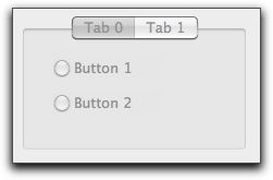
In some cases you build portions of your interface by placing some controls within another control. For example, you use the GroupBox control to organize other controls, usually RadioButtons or possibly Checkboxes. The TabPanel and PagePanel controls also designed to enclose other controls.
The control that encloses the others is known as the parent control and the controls that are entirely within its borders are the child controls. This works automatically if you create the controls in the order of: parent-child. That is, create the control that encloses the others first, then create the child controls or duplicate existing child controls and keep them inside the parent control.
You can use the Parent property of the RectControl class to either get or set the parent of an existing control. If you create a child control before its parent, you can set its parent using its Parent property.
If a control is not completely enclosed by another control then it doesn't automatically become a child; it overlaps the other control.
If you move a child outside its parent, it is no longer a child of that control. If you move it completely inside another control, it becomes the child of that control.
When you copy a parent control, you copy all its child controls as well.
You can create more than one level of nesting. For example, you can place a GroupBox within a TabPanel and then place several RadioButton. In this case, the GroupBox is the parent of the RadioButton is the parent of the GroupBox. To make this work automatically, you must create them in the order that respects the hierarchy: first create the TabPanel, then the GroupBox, and then the RadioButtons.
Obviously, the parent control must be in the same window as its child controls. If you attempt to get the parent of a control whose parent is in another window, you will get an InvalidParentException error.
If a control is not enclosed by another control, then its “parent” is its window. But, since the Parent property of a control is a Control, the Parent property will be Nil-since a Window is not subclassed from the Control class. Before trying to access the Parent property of a control, be sure to first test whether it is Nil. If you don't, you will get a NilObjectException error if the control's "parent" is the parent window.
If a control is enclosed by another control, but you don't want it to behave as a child, then set its Parent property to Nil. This breaks the default Parent-Child relationship that is normally maintained by the control hierarchy.
Control hierarchy features
To take advantage of the features of the control hierarchy automatically, create the parent control first and then add the child controls by dragging fully into the interior of the parent control. When you add a child to a parent in this manner, a marquee surrounds the parent. A marquee also surrounds the parent control whenever you select an existing child control. You can disable the marquee in Preferences/Options.
If you duplicate a child control and leave the duplicate within the parent, then it is automatically a child. However, if you move the duplicate outside the parent, it is no longer a child. A control must be fully enclosed by the parent to be considered a child.
In the following example, both TextField. It is no longer a child.
When you move a child out of the'scope' of the parent, the marquee surrounding the parent is turned off, indicating that the child is not under parental control anymore.
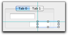
If you move the bottom TextField back within the TabPanel, it becomes a child of the TabPanel once again.
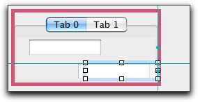
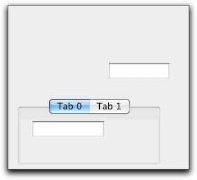
Moving a parent control moves its child controls as well. In the following example, the TabPanel shown above was moved down. It takes the top TextField with it, but leaves the bottom one orphaned.
Deleting a parent control deletes all child controls.
Hiding a parent hides all child controls, but retains the previous visibility status of all children.
Showing a parent control shows only the child controls whose visibility is set.
Disabling a parent control disables all its child controls, but retains the previous visibility status of all children. In the IDE, disabling a container visually disables all the child controls, but does not update the Enabled property.
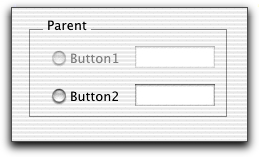
Here is a disabled GroupBox in the IDE in which two RadioButtons and two TextFields are children. When the GroupBox is disabled, all four children are disabled. Since all children are disabled when a parent is disabled, the TextFields are not enterable.
Enabling a parent control enables only the child controls whose Enabled property is set.
In the following example, only the bottom row of child controls have the Enabled property set. When the GroupBox is enabled the top row of controls remains disabled.
Disabling the GroupBox disables all child controls, as expected.
Dragging
There are three possible items a user can drag from a control: text, a picture, and/or a FolderItem. In order for the user to be able to drag, the control must create a DragItem object in the appropriate event handler. The appropriate event handler depends on the type of object. For example, the appropriate event handler for a Canvas control is the MouseDown event handler since the user must be holding down the mouse button to drag.
The DragItem object represents the data that the user is dragging. DragItem objects have properties to hold text, pictures, and folderItems. One or more of these properties must be populated with the values the user wishes to drag. When you create a new DragItem object using the DragItem constructor, you specify the drag rectangle that will appear as the user drags from the control.
TextFields, TextAreas, and ListBoxes have implicit dragging built in to them. This means that they will create a new DragItem and drag rectangle for you. TextFields and TextAreas automatically populate the Text property of the DragItem with the text the user is dragging. ListBoxes have a DragRow event handler where you can populate the DragItem with the data to be dragged.
Dropping
Before a control will accept an item being dropped on it, you must call the AcceptFileDrop, AcceptPictureDrop, AcceptRawDataDrop, and/or AcceptTextDrop methods to indicate the drop types that will be allowed. This is usually done in the control's Open event handler. When an acceptable item is dropped on the control, the control's DropObject event handler will execute and will be passed the DragItem that has been dropped on the control. At that point you can use the DragItem's methods to determine what kind of data is available and access it. If you are only allowing a particular type of drag data (text for example) then there would be no need to test the type of data that is being dragged. You can get the text from the Text property of the DragItem.
Changing the cursor
The MouseCursor property controls which cursor will be displayed while the mouse is within the control, assuming that the MouseCursor properties of the DesktopApplication and parent Window classes are Nil. You can, for example, assign different MouseCursors to different controls within a window and the shape of the pointer will change whenever it is over a particular control. The Cursors module contains a library of custom cursors that you access with the syntax System.Cursors.MouseCursorName. Please see the MouseCursor class for information about the library of custom cursors.
If you also need custom cursors at the Window or Application levels, you need to manage them along the lines described in the section on the MouseCursor class.
Custom cursors in windows
Custom cursors based on images may be used under both macOS and Windows OS, but the Windows CURS resource is still supported for legacy cursors.
With a resource editor, create a CURS resource that contains only one cursor. Give the resource file a name that indicates the type of cursor contained in the resource file.
Repeat this process for each custom cursor.
Add all the resource files to the Project Editor.
You can then access each custom cursor by name, e.g.
Me.MouseCursor = Pen
Sample code
This example shows how the DropObject event handler of a TextArea (named TextArea1 in this example) would be coded to handle one or more text documents or some text being dropped on it:
Sub DropObject(Obj As DragItem, action As Integer)
If Obj.TextAvailable Then
  TextArea1.Text = Obj.Text
ElseIf Obj.FolderItemAvailable Then
  Do
    ' Load the styled text from the document
    ' into TextArea1
    If Not TextArea1.Open(Obj.FolderItem) Then
      MessageBox("Drag Failed")
    End If
    Loop Until Not Obj.NextItem
End If
Compatibility
All project types on all supported operating systems.