Class
DesktopSegmentedButton
Description
A control that is a horizontal button made up of multiple, independent segments.
Properties
Name |
Type |
Read-Only |
Shared |
|---|---|---|---|
✓ |
|||
✓ |
|||
✓ |
|||
✓ |
|||
✓ |
|||
✓ |
|||
✓ |
|||
✓ |
Methods
Name |
Parameters |
Returns |
Shared |
|---|---|---|---|
FileType As String |
|||
Type As String |
|||
segment As Segment |
|||
x As Integer, y As Integer, width As Integer, height As Integer, immediately As Boolean = False |
|||
index As Integer |
|||
index As Integer |
|||
Events
Name |
Parameters |
Returns |
|---|---|---|
Base As DesktopMenuItem, x As Integer, y As Integer |
||
HitItem As DesktopMenuItem |
||
obj As DragItem, Action As DragItem.Types |
||
obj As DragItem, Action As DragItem.Types |
||
x As Integer, y As Integer, obj As DragItem, Action As DragItem.Types |
||
obj As DragItem, action As DragItem.Types |
||
Key As String |
||
Key As String |
||
X As Integer, Y As Integer, DeltaX As Integer, DeltaY As Integer |
||
segmentIndex As Integer |
Enumerations
DesktopSegmentedButton.MacButtonStyles
SelectionStyles
Specifies the different styles of selection available.
Enum
Description
Single
Like a group of radio buttons, only one segment can be selected at a time.
Multiple
Like a group of checkboxes, any number of segments can be selected at a time.
None
Like a series of buttons, no segment can remained selected once pressed.
Property descriptions
DesktopSegmentedButton.Active
Active As Boolean
Indicates whether the control is active.
Active is False when the control's window is not in the foreground. When a DesktopWindow is deactivated, its controls are automatically deactivated unless AllowAutoDeactivate is set to False.
This property is read-only.
DesktopSegmentedButton.AllowAutoDeactivate
AllowAutoDeactivate As Boolean
Determines whether the control should be deactivated (on macOS) when the parent window is deactivated. The default is True.
DesktopSegmentedButton.AllowTabStop
AllowTabStop As Boolean
If True, the control is in the Tab Order and accepts the focus when the user tabs into it. The default is True. If False, the user cannot tab into it to give it the focus. However, the control can gain the focus by other means, such as the user's clicking on it or by setting the focus in code.
This example removes the control from the Tab Order:
Me.AllowTabStop = False
DesktopSegmentedButton.Enabled
Enabled As Boolean
Determines if the control should be enabled when the owning window is opened.
A disabled control cannot be clicked and cannot receive the focus.
This example disables the control.
Me.Enabled = False
DesktopSegmentedButton.Handle
Handle As Ptr
Returns a handle to the control.
This property is read-only.
For interfacing with Mac APIs using Declares, DesktopControl.Handle returns NSViews (except for DesktopToolbar).
On Windows returns the HWND of the control.
On Linux it returns a GtkWidget.
The following gets a handle to the control.
Var p As Ptr = Me.Handle
DesktopSegmentedButton.Height
Height As Integer
The height (in points) of the control.
This example sets the height of the control to 100:
Me.Height = 100
DesktopSegmentedButton.Index
Index As Integer
If the control is used in a control set, this specifies the control's index in the set.
DesktopSegmentedButton.LastSegmentIndex
LastSegmentIndex As Integer
The number of the last Segment of the DesktopSegmentedButton.
This property is read-only.
DesktopSegmentedButton.Left
Left As Integer
The distance from the left side of the control to the left side of its containing window or container.
The following example moves the control 100 points from the left side of the window:
Me.Left = 150
DesktopSegmentedButton.LockBottom
LockBottom As Boolean
Determines whether the bottom edge of the control should stay at a set distance from the bottom edge of the parent control, if there is one, or the owning window.
This property can be set in the control's Inspector. The following example sets it in code.
Me.LockBottom = True
DesktopSegmentedButton.LockLeft
LockLeft As Boolean
Determines whether the left edge of the control should stay at a set distance from the left edge of the parent control, if there is one, or the owning window.
LockLeft and Locktop default to True when you add a new control to a window. Existing controls will be altered only if LockRight and/or LockBottom are not set. LockLeft has no effect unless LockRight is True.
This property can be set in the control's Inspector. The following example sets it in code.
Me.LockLeft = True
DesktopSegmentedButton.LockRight
LockRight As Boolean
Determines whether the right edge of the control should stay at a set distance from the right edge of the parent control, if there is one, or the owning window.
This property can be set in the control's Inspector. The following example sets it in code.
Me.LockRight = True
DesktopSegmentedButton.LockTop
LockTop As Boolean
Determines whether the top edge of the control should stay at a set distance from the top edge of the parent control, if there is one, or the owning window.
LockTop and LockLeft default to True when you add a control to a window. Existing controls will be altered only if LockRight and/or LockBottom are not set. LockTop has no effect unless LockBottom is True.
This property can be set in the control's Inspector. The following example sets it in code.
Me.LockTop = True
DesktopSegmentedButton.MacButtonStyle
MacButtonStyle As MacButtonStyles
Controls the appearance of the DesktopSegmentedButton on macOS.
Use MacButtonStyles to set/get this property.
Not all button styles are available on all versions of macOS.
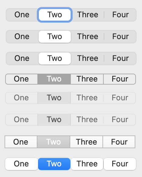
This code is in the Opening event of the control but will only take effect when building for macOS. It sets the style to Rounded.
Me.MacButtonStyle = DesktopSegmentedButton.MacButtonStyles.Rounded
DesktopSegmentedButton.MouseCursor
MouseCursor As MouseCursor
The cursor to be displayed while the mouse is within the control and both the DesktopApplication and DesktopWindow class's MouseCursor properties are Nil.
If the DesktopApplication class's MouseCursor property is not Nil or the DesktopWindow's MouseCursor property is not Nil, then any control's MouseCursor property is ignored. You can use a cursor stored in the Cursors module. On Macintosh, you can also obtain a MouseCursor from a resource file.
This line in the Opening event of the control sets the default cursor to the finger pointer.
Me.MouseCursor = System.Cursors.FingerPointer
DesktopSegmentedButton.Name
Name As String
The name of the control. Set the name of the control in the Inspector.
This property is read-only.
DesktopSegmentedButton.PanelIndex
PanelIndex As Integer
If the control has been placed on a DesktopTabPanel or DesktopPagePanel control, this is the panel (page/tab) that the control is on. If the control is not on a panel, it returns -1.
The first panel is numbered zero. If the control has been placed on a panel of a DesktopTabPanel or DesktopPagePanel control, it returns the panel number. If the control is not on a DesktopPagePanel or DesktopTabPanel, it returns -1. If you change the PanelIndex to a nonexistent panel, the control will disappear until you give it a PanelIndex value that corresponds to a panel that exists.
If you are looking to change the currently selected panel (page/tab), use DesktopPagePanel.
This code displays the panel index of the control that is on the page.
MessageBox(Me.SelectedPanelIndex.ToString)
DesktopSegmentedButton.Parent
Parent As Object
Used to get and set the control's parent control or window.
If the control is on the window, the Parent will be the Window. If the control is on the container, the Parent will be the container. If the control is completed enclosed by another control, the Parent will be that control.
If you do not want the enclosing control to be the parent, set the Parent property of that control to Nil to make it the Window.
If the parent control is somehow in another window, an InvalidParentException will occur.
The following example sets the parent of the control to the window.
Me.Parent = Nil
DesktopSegmentedButton.Scope
Scope As Integer
Used to determine whether access to the control is Public (0) or Private (2). The default is Public.
This property is read-only.
Note
This is a designtime-only property and thus can only be set in the Inspector and is not accessible via code.
If the Scope of a control is set to Private, it cannot be accessed from outside its parent window.
DesktopSegmentedButton.SegmentCount
SegmentCount As Integer
The number of Segments in the DesktopSegmentedButton.
This property is read-only.
This example displays the number of segments in the DesktopSegmentedButton.
MessageBox(SegmentedButton1.SegmentCount.ToString)
DesktopSegmentedButton.SelectedSegment
SelectedSegment As Segment
Provides the Segment at the requested index.
This property is read-only.
For multi-selection SegmentedButtons this returns the last segment that was selected.
DesktopSegmentedButton.SelectedSegmentIndex
SelectedSegmentIndex As Integer
Used to get or set the selected segment number. The first segment is numbered zero.
A value of -1 means no selection. SelectedSegmentIndex may be set using the Properties pane to set the default value of the SegmentedButton control. SelectedSegmentIndex is only useful when SelectionStyle is set to Single. SelectedSegment will provide you with the Segment for the selected segment.
For multi-selection SegmentedButtons this returns the last segment that was selected.
If SelectionStyle is set to Multiple, you must use SegmentAt to check each segment's Selected property to see if it's True or not.
The following example changes the selected segment to the third segment:
SegmentedButton1.SelectedSegmentIndex = 2
DesktopSegmentedButton.SelectionStyle
SelectionStyle As SelectionStyles
The style of selection for the control. The options are Single, Multiple or None. See SelectionStyles for details.
DesktopSegmentedButton.TabIndex
TabIndex As Integer
The control's position in the Tab Order. The control with whose TabIndex is 0 will get the focus first.
On macOS, only controls where you enter data from the keyboard typically get the focus. In order to manually set focus to controls that don't allow keyboard entry, go to System Preferences, click on the Keyboard icon then on the Shortcuts tab and then check the Use keyboard navigation to move focus between controls checkbox.
This example sets the control's TabIndex.
Me.TabIndex = 2
DesktopSegmentedButton.Tooltip
Tooltip As String
Text of help message displayed as a Windows or Linux "tooltip" or macOS help tag.
The tip/tag is displayed when the user hovers the mouse cursor over the control.
This example adds a tooltip to a control:
Me.Tooltip = "Click to bark."
DesktopSegmentedButton.Top
Top As Integer
The distance from the top of the control to the top of its containing window or container.
This example sets the top of the control to 140 points from the top of the window:
Me.Top = 140
DesktopSegmentedButton.Transparent
Transparent As Boolean
Determines whether the control is transparent on Windows. The default is False. Has no effect on macOS or Linux.
Transparent controls draw more slowly and use more memory in order to cache the background. Unless you absolutely require transparency, leave this set to False.
For projects that were created prior to 2018r1, this property defaults to True to emulate previous behavior. Consider changing it to False to improve performance if you do not require transparency.
DesktopSegmentedButton.Visible
Visible As Boolean
Determines whether the control is visible when its owning window is opened. The default is True: the control is visible.
The following code makes the control invisible:
Me.Visible = False
DesktopSegmentedButton.Width
Width As Integer
The width (in points) of the control.
The following example resizes the control:
Me.Width = 200
DesktopSegmentedButton.Window
Window As DesktopWindow
The control's parent window.
This property is read-only.
This code gets the parent window's Title property.
MessageBox(Me.Window.Title)
Method descriptions
DesktopSegmentedButton.AcceptFileDrop
AcceptFileDrop(FileType As String)
Permits documents of type FileType to be dropped on the control. FileType must be a file type that you defined in via the FileType class or the File Type Sets Editor.
This code in the Opening event makes it possible for the user to drop either a picture or a file that is a jpeg image. The File Type Sets editor was used to define the “image/jpeg” file type. It is one of the “Common File Types” that is available in the editor.
Me.AcceptPictureDrop
Me.AcceptFileDrop("image/jpeg")
To restrict file drops to specific file types on macOS, in addition to creating a File Type (as a project item or via code) to define the file extension, you must also use the DragEnter event:
For example, to restrict drops to folders only:
If Not obj.FolderItem.IsFolder Then Return TrueTo restrict drops to a files with a specific extension:
If Not obj.FolderItem.Extension <> ".my_extension" Then Return True
DesktopSegmentedButton.AcceptPictureDrop
AcceptPictureDrop
Permits pictures to be dropped on the control.
If a control should accept pictures in a drag and drop, then AcceptPictureDrop needs to be called prior to the drop. Typically, it is in the Opening event of the control itself. For example, the line:
Me.AcceptPictureDropin the Opening event of the control that will receive the dragged pictures is needed. When the picture is dropped, the DropObject event is called and this is where you will put your code to handle the drop.
Opening Event:
Me.AcceptPictureDropDropObject Event:
If obj.PictureAvailable Then
  Me.Backdrop = obj.Picture
End If
DesktopSegmentedButton.AcceptRawDataDrop
AcceptRawDataDrop(Type As String)
Permits data (of the Type specified) to be dropped on the control.
The following specfies a generic file type defined in the File Type Sets editor.
Me.AcceptRawDataDrop("????")
DesktopSegmentedButton.AcceptTextDrop
AcceptTextDrop
Permits text to be dropped on the control.
This line in the Opening event of a control that can accept dragged text.
Me.AcceptTextDrop
DesktopSegmentedButton.AddSegment
AddSegment(segment As Segment)
Adds Segment as a new segment at the end of the control.
The following example in the Opening event of the control adds a segment to it:
Var seg As New Segment
seg.Title = "Banana"
Me.AddSegment(seg)
DesktopSegmentedButton.AddSegmentAt
AddSegmentAt(index As Integer, segment As Segment)
Creates a new segment at index (moving the existing segments over).
The following example adds a segment at the 4th position.
Var s As New Segment
s.Title = "Harry"
SegmentedButton1.AddSegmentAt(3, s)
DesktopSegmentedButton.Close
Close
Closes a control.
Closing a control permanently removes the control from memory, making it impossible to access. You can close both non-indexed controls and indexed controls. When you close an indexed control, the indexes for the remaining controls will shift downward so that the indexes start with zero and are consecutive.
The following code closes the control. When this is executed from a visible control, the control disappears from the window.
Me.Close
DesktopSegmentedButton.DrawInto
DrawInto(g As Graphics, x As Integer, y As Integer)
Draws the contents of the control into the specified Graphics context. The parameters x and y are the coordinates of the top, left corner.
Note
DrawInto will only work if the control is on a window or container.
This example draws the current control into the Graphics of a Picture and then displays it as the Backdrop of a Canvas:
Var p As New Picture(Me.Width, Me.Height)
Me.DrawInto(p.Graphics, 0, 0)
Canvas1.Backdrop = p
DesktopSegmentedButton.Refresh
Refresh(immediately As Boolean = False)
Redraws the portion specified of the contents of the control the next time the OS redraws the control or immediately if True is passed.
If you are calling this so frequently that you experience a slowdown in your code, pass True for the immediately parameter.
Calling this method causes the Render event to fire.
Refresh the entire area immediately:
Me.Refresh(True)
DesktopSegmentedButton.Refresh
Refresh(x As Integer, y As Integer, width As Integer, height As Integer, immediately As Boolean = False)
Redraws the portion specified of the contents of the control the next time the OS redraws the control or immediately if True is passed.
Refresh a portion of the area the next time the OS redraws the control:
Me.Refresh(100, 150, 200, 300)
DesktopSegmentedButton.RemoveAllSegments
RemoveAllSegments
Removes all segments in the control.
The following example (in any event of a DesktopSegmentedButton removes all the existing segments:
Me.RemoveAllSegments
DesktopSegmentedButton.RemoveSegmentAt
RemoveSegmentAt(index As Integer)
Removes the specified segment. The first segment is numbered zero.
When in any event of a segmented control, the following example removes the third segment (index position 2) from the segmented control:
Me.RemoveSegmentAt(2)
DesktopSegmentedButton.ResizeSegmentsToFit
ResizeSegmentsToFit
Sizes the control to fit into its space, increasing or decreasing its width as necessary. Use this after making changes to the Segment width.
If a Segment's Width is set to 0, ResizeSegmentsToFit calculates the minimum width needed to contain that segment's caption and icon and uses that width when sizing the control. The Width property of the segment remains 0 after the call.
If you add a new segment, the SegmentedButton does not resize to fit it so you need to call ResizeSegmentsToFit:
' Add a new segment
Var seg As New Segment
seg.Title = "Seg " + Str(SegmentedButton1.LastSegmentIndex + 1)
SegmentedButton1.AddSegment(seg)

SegmentedButton1.ResizeSegmentsToFit
If you need to keep the SegmentedButton width the same then you will want to resize the individual segments to fit within the SegmentedButton width. This example shows how to do that:
Var seg As New Segment
seg.Title = "Seg " + Str(SegmentedButton1.LastSegmentIndex + 1)

SegmentedButton1.AddSegment(seg)

' Resize all the segments
For i As Integer = 0 To SegmentedButton1.LastSegmentIndex
  Var item As Segment = SegmentedButton1.SegmentAt(i)
  item.Width = SegmentedButton1.Width / (SegmentedButton1.LastSegmentIndex + 1) - 2
Next
This example demonstrates how to dynamically change a DesktopSegmentedButton's properties on the fly. For example, this code on a DesktopButton increases the size of the selected segment. The code cycles through all the segments and increases the size of each segment that is selected. The loop creates an instance of a Segment for each segment, tests whether it is selected using the Selected property, and then increases the width for only the selected ones. This will increase the overall width of the SegmentedControl:
' count down to avoid re-evaluating the Ubound all the time
For i As Integer = SegmentedButton1.LastSegmentIndex DownTo 0

  ' get the reference to the segment
  Var s As Segment = SegmentedButton1.SegmentAt(i)

  ' see if the segment was selected
  If s.Selected Then
    ' it is selected so increase this segment in size
    s.Width = s.Width + 10
  End If
Next

' make sure the segmented control knows to resizes its drawing boundaries or you can get weird effects
SegmentedButton1.ResizeSegmentsToFit
DesktopSegmentedButton.SegmentAt
SegmentAt(index As Integer) As Segment
Returns the Segment instance at the index requested.
Use this property to change the properties of each Segment in the DesktopSegmentedButton.
This code loops through all the segments and changes their Titles:
Var seg As Segment

For position As Integer = 0 To SegmentedButton1.LastSegmentIndex
  seg = SegmentedButton1.SegmentAt(position)
  seg.Title = position.ToString
Next
This code adds a new segment and then resizes all the segments so that they are visible:
Var seg As New Segment
seg.Title = "Seg " + SegmentedButton1.SegmentCount.ToString

SegmentedButton1.AddSegment(seg)

' Resize all the segments
For i As Integer = 0 To SegmentedButton1.LastSegmentIndex
  Var item As Segment = SegmentedButton1.SegmentAt(i)
  item.Width = SegmentedButton1.Width / (SegmentedButton1.SegmentCount) - 2
Next
DesktopSegmentedButton.SetFocus
SetFocus
If applicable, sets the focus to the DesktopUIControl. KeyDown events are directed to the control.
If the control cannot get the focus on the platform on which the application is running, SetFocus does nothing. The SetFocus method of the DesktopWindow class or the ClearFocus method can be used to remove the focus from the control that currently has the focus, leaving no control with the focus.
Note
On macOS, you need Full Keyboard Access turned on in System Preferences (Keyboard->Shortcuts) in order to manually set focus to non-text controls.
The following example in the Opening event sets the focus to the that control. If another control has the focus when this line is executed, then the user sees this control gets the focus.
Me.SetFocus
Event descriptions
DesktopSegmentedButton.Closing
Closing
The control is closing.
DesktopSegmentedButton.ConstructContextualMenu
ConstructContextualMenu(Base As DesktopMenuItem, x As Integer, y As Integer) As Boolean
This event is called when it is appropriate to display a contextual menu for the control.
This event handler is the recommended way to handle contextual menus because this event figures out whether the user has requested the contextual menu, regardless of how they did it. Depending on platform, it might be in the MouseUp or MouseDown event and it might be a right+click or by pressing the contextual menu key on the keyboard, for example.
Base is analogous to the menu bar for the contextual menu. Any items you add to Base will be shown as menu items. If you return False, the event is passed up the parent hierarchy.
If you return True, the contextual menu is displayed. The parameters x and y are the mouse locations. If the event was fired because of a non-mouse event, then x and y are both set to -1. See the example of a contextual menu in the following section.
The following ConstructContextualMenu event handler builds a menu with three menu items plus a submenu with three additional menu items.
' Add some items
base.AddMenu(New DesktopMenuItem("Test 1"))
base.AddMenu(New DesktopMenuItem("Test 2"))
base.AddMenu(New DesktopMenuItem("Test 3"))

' Add a Separator
base.AddMenu(New DesktopMenuItem(DesktopMenuItem.TextSeparator))

' Add a sub menu
Var submenu As New DesktopMenuItem("SubMenu")
submenu.AddMenu(New DesktopMenuItem("SubMenu Test 1"))
submenu.AddMenu(New DesktopMenuItem("SubMenu Test 2"))
submenu.AddMenu(New DesktopMenuItem("SubMenu Test 3"))
base.AddMenu(submenu)

' Add a Separator
base.AddMenu(New DesktopMenuItem(DesktopMenuItem.TextSeparator))

Return True
DesktopSegmentedButton.ContextualMenuItemSelected
ContextualMenuItemSelected(HitItem As DesktopMenuItem) As Boolean
Fires when a contextual menuitem selectedItem was selected but the MenuItemSelected event and the MenuHandler for the DesktopMenuItem did not handle the menu selection.
This event gives you a chance to handle the menu selection by inspecting the menuitem's Text or Tag properties to see which item was selected. Use this in conjunction with ConstructContextualMenu if you have not specified the MenuItemSelected event or the Menu Handler for the items on the contextual menu. See the example of a contextual menu in the examples for the DesktopUIControl class.
Return True if this event has handled the item the user chose from the contextual menu. Returning False will cause the control's parent to execute its ContextualMenuItemSelected event. This can be handy if you have the same contextual menu for several controls who share the same Parent (several on the same window for example). By returning False you can handle them all in a single event.
This simple event handler displays the value of the selected menu item.
If selectedItem <> Nil Then MessageBox(selectedItem.Text)
Return True
DesktopSegmentedButton.DragEnter
DragEnter(obj As DragItem, Action As DragItem.Types) As Boolean
Fires when the passed DragItem enters the DesktopUIControl.
Returns a Boolean. Return True from this event to prevent the drop from occurring.
The Action parameter specifies the type of drag action.
To restrict file drops to just folders (and not files), you can put this code in the DragEnter event:
If Not obj.FolderItem.IsFolder Then Return True
DesktopSegmentedButton.DragExit
DragExit(obj As DragItem, Action As DragItem.Types)
Fires when the passed DragItem exits the DesktopUIControl.
The Obj parameter is the item being dragged. The Action parameter specifies the type of drag action.
DesktopSegmentedButton.DragOver
DragOver(x As Integer, y As Integer, obj As DragItem, Action As DragItem.Types) As Boolean
Fires when the DragItem is over the DesktopUIControl.
The Obj parameter is the object being dragged. The coordinates x and y are relative to the DesktopUIControl. Returns a Boolean. Return True from this event to prevent the drop from occurring.
The Action parameter specifies the type of drag action, which is typically done by holding down a modifier key (Shift, Alt, Option, Command, etc.) while doing the drag.
DesktopSegmentedButton.DropObject
DropObject(obj As DragItem, action As DragItem.Types)
The item represented by obj has been dropped on the control.
The obj parameter is the object being dragged. The action parameter specifies the type of drag action.
The following DropObject event handler can handle either a dropped picture or a dropped file. The type of file that it can handle needs to have been specified in a call to AcceptFileDrop prior to the drop, for example, in the Opening event.
If Obj.PictureAvailable Then
  Me.Image = obj.Picture
ElseIf Obj.FolderItemAvailable Then
  Me.Image = Picture.Open(obj.FolderItem)
End If
DesktopSegmentedButton.FocusLost
FocusLost
The control has lost the focus.
Note
On macOS, controls other than text fields and lists will accept and lose focus only if the full keyboard access option is enabled in System Preferences/Keyboard.
DesktopSegmentedButton.FocusReceived
FocusReceived
The control has received the focus and has a selection rectangle around it.
Note
On macOS, controls other than text fields and lists will accept focus only if the full keyboard access option is enabled in System Preferences/Keyboard.
DesktopSegmentedButton.KeyDown
KeyDown(Key As String) As Boolean
DesktopSegmentedButton.KeyUp
KeyUp(Key As String)
Fires when the passed Key is released in the control that has the focus.
It is not guaranteed to be the same key that received the KeyDown event.
DesktopSegmentedButton.MouseDown
MouseDown(X As Integer, Y As Integer) As Boolean
The mouse button was pressed inside the control's region at the location passed in to x, y.
This event fires repeatedly while the mouse button is being held down.
The coordinates x and y are local to the control, i.e. they represent the position of the mouse click relative to the upper-left corner of the control.
Return True if you are going to handle the MouseDown. In such a case:
The Pressed event, if any, will not execute and the state of the object will not change.
You will receive the MouseUp event.
If you return False, the system handles the MouseDown so the MouseUp event handler does not get called.
The MouseDown event uses the DragItem constructor when the user drags the contents of the control. It is:
Var d As DragItem
d = New DragItem(Self, Me.Left, Me.Top, Me.Width, Me.Height)
d.Picture = Me.Image
d.Drag ' Allow the drag
DesktopSegmentedButton.MouseDrag
MouseDrag(X As Integer, Y As Integer)
The mouse button was pressed inside the control and moved (dragged) at the location local to the control passed in to x, y.
This event fires repeatedly while the mouse button is down regardless of whether or not the mouse coordinates are changing.
This event will not occur unless you return True in the MouseDown event.
DesktopSegmentedButton.MouseEnter
MouseEnter
The mouse has entered the area of the control.
DesktopSegmentedButton.MouseExit
MouseExit
The mouse has left the area of the control.
DesktopSegmentedButton.MouseMove
MouseMove(X As Integer, Y As Integer)
The mouse has moved within the control to the coordinates passed. The coordinates are local to the control, not to the window.
DesktopSegmentedButton.MouseUp
MouseUp(X As Integer, Y As Integer)
The mouse button was released. Use the x and y parameters to determine if the mouse button was released within the control's boundaries.
Note
This event will not occur unless you return True in the MouseDown event. The return value is ignored.
The parameters x and y are local coordinates, i.e. they represent the position of the mouse click relative to the upper-left corner of the control. Mouse clicks that are released to the left or above a control are negative.
DesktopSegmentedButton.MouseWheel
MouseWheel(X As Integer, Y As Integer, DeltaX As Integer, DeltaY As Integer) As Boolean
The mouse wheel has been moved.
The parameters X and Y are the mouse coordinates relative to the control that has received the event. The parameters DeltaX and DeltaY hold the number of scroll lines the wheel has been moved horizontally and vertically, as defined by the operating system. DeltaX is positive when the user scrolls right and negative when scrolling to the left. DeltaY is positive when the user scrolls down and negative when scrolling up.
Returns a Boolean. Return True to prevent the event from propagating further.
DesktopSegmentedButton.Opening
Opening
The control is about to be displayed. Use this event to initialize a control.
The Opening event is called after the Constructor.
Be warned that initializing control property values using the Constructor instead of the Opening event may result in those property values being overwritten by what is set in the Inspector. For best results, use the Opening event for control initialization rather than the control Constructor.
If the control is supposed to handle drag and drop, you need to tell it which type of item it needs to be able to handle. The following example informs the control that pictures and files can be dropped on it. The type of the file it needs to support is specified via the File Types Editor.
Sub Opening()
  Me.AcceptPictureDrop
  Me.AcceptFileDrop("JPEG")
End Sub
DesktopSegmentedButton.Pressed
Pressed(segmentIndex As Integer)
One of the segments was pressed or otherwise activated.
Check the SelectedSegmentIndex to determine which segment was pressed.
Notes
The easiest way to configure a SegmentedButton is to use the Segment Edit dialog in the IDE by clicking "Edit" in the Inspector. With it, you can create, delete, or reorder segments, label them, add an icon, and choose the selected segment or segments. (If the SelectionStyle is Multiple, you can have more than one selected segment.)
You set the behavior of the control with the SelectionStyle property. It enables you to choose whether the set of segments behaves as a group of radio buttons, a group of checkboxes, or a group of button. If it behaves like a group of checkboxes (Multiple), more than one can be selected at the same time. If it behaves like a button (None), then it is "selected" only while the mouse is held down.
If you want to do this work using code, you can address each segment with the Segment class. You instantiate an instance of this class for the segment that you want to address.
Sample code
If you have placed an instance on a window, called SegmentedButton1, you can set or get the properties of any one segment with code like the following
Var s As Segment
s = SegmentedButton1.SegmentAt(0)

If s.Selected Then
  ' code
Else
  ' more code
End If
When a segment is selected the Pressed event runs and is passed the index of the segment that was pressed:
If segmentIndex = 0 Then
  ' code for when segment 0 is selected
Else
  ' code for when segment 1 is selected
End If
Compatibility
Project Types |
Desktop |
Operating Systems |
All |
See also
DesktopUIControl parent class; DesktopButton, Segment classes