Custom controls
You can create your own custom controls by subclassing built-in controls, drawing them entirely using a Canvas or by combining controls using a Container.
Subclassing built-in controls
You can create your own custom controls by subclassing any of the built-in controls. For example, desktop projects do not have a “Link” control, which would be useful to open the default browser to the specified URL. To create such a control, you could start by subclassing the Label control.
Drag a Label from the Library to the Navigator. This adds a new control called “CustomLabel”. Change its name to “LinkLabel”.
Using the Add button on the Editor toolbar for LinkLabel, choose Property. Change the property name to “URL” with Type “String”.
Using the Add button on the Editor toolbar for LinkLabel, choose Event Handler and then select the MouseDown event.
Add this code:
System.GotoURL(URL)
Now you can drag LinkLabel from the Navigator onto a Window and set the URL property in its Opening event:
Me.URL = "https://www.wikipedia.org"
You might also want to change its Text property to be “Wikipedia” so it is more obvious what will happen when it is clicked.
Run the project and click on the LinkLabel. Your default browsers opens to the Wikipedia web site.
Refer to Subclassing Examples for other examples of subclassing.
Inspector Behavior
When creating custom controls, you may want to make some of its properties changeable at design time in the Inspector. Using the LinkLabel example above, it would be better if you could set the URL property in the Inspector for the control on the layout rather than having to put code in the Opening event.
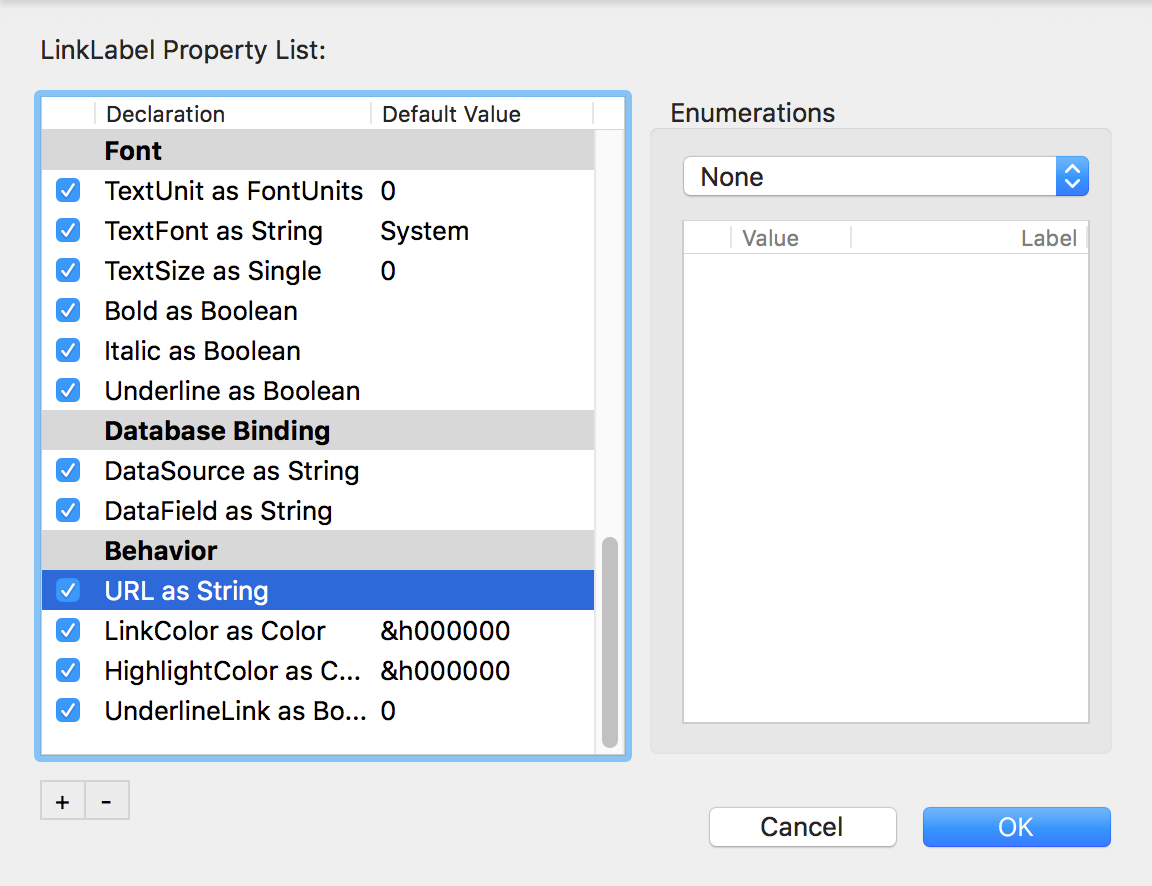
You use the Changing Properties With the Inspector feature to control what displays in the Inspector. To use it, open the contextual menu for LinkLabel in the Navigator and select Inspector Behavior. This opens the Inspector Behavior dialog. In this dialog, you can control all the properties that appear in the Inspector, including any new ones that you add. If you scroll down, you will see the URL parameter. Check the box next to its name and click OK to have the property displayed in the Inspector for the control when it is on a layout. Now you can specify the URL in the Inspector and remove the Opening event from the LinkLabel.
Here are the steps in general:
Create your custom control.
Select the proper Inspector Behavior entries to expose in the IDE.
Drag and drop the custom control onto your layout.
Scroll the inspector to the appropriate section (usually Behaviors) to see your exposed properties.
Other features of the Inspector Behavior dialog
The Inspector Behavior dialog allows you to control all aspects of what appears in the Inspector. You can:
Add or remove group headings: Use the “+” or “-” buttons below the list or use the contextual menu.
Change the order of the properties, including moving them to different groups: Drag properties around as needed.
Set or modify default values: Double-click in the Default Value column for the property to set or modify the default value.
Change whether a property is shown or hidden: Check the property to display it; uncheck it to hide it.
Add enumerations: Use the Enumerations control on the right to add values that the user can select from a list.
Setting a default event
If your custom control has events, you may want to indicate one to be the default event. This is the event that will be selected when the user adds a new event to an instance of your custom control. You can indicate the default event by selected your custom control class in the Navigator then using the Property Inspector to add an attribute to your custom control class. Attributes are found on the Advanced tab of the Inspector. Set the name to "DefaultEvent" and the value to the name of the event you wish to be the default.
Using subclassed controls in your projects
When you've created subclassed controls, there are a couple ways you can add them to a layout. For smaller projects you may find it is fast and easy to select the destination layout project item and then drag the subclassed control from the Navigator onto the layout.
You can also find subclassed controls in the Library. If you have "Group Banners" turned on for the Library you'll find any subclassed controls in the "Project Controls" section at the end. You can drag a subclassed control that appears here onto the layout the same as you can for any of the built-in controls.
If you want to display a description for your own control in the Library, use the "LibraryDescription" attribute and its value text as a description in your class.
If you have a subclassed control that you do not want to appear in the Library you can "hide" it by setting a special attribute on the subclassed control. Add the HideFromLibrary attribute to the subclassed control and it will not appear in the Library.
Property value assignment
When you create control subclasses, the values of public properties are set in this order:
They are assigned values set by the subclass itself, either in the Constructor or as defaults.
The above values are overridden by default values for properties specified in the Inspector Behavior window.
The above values are overridden by values changed in the Inspector.