Screen Design Considerations
A Layout defines how your initial layout appears on the iOS device. By default your iOS project contains two screens: iPhoneLayout and iPadLayout. You can change the preview mode for the layout by using the toolbar buttons to change the orientation (portrait or landscape) and the device type. These settings affect the preview only, are not saved, and do not affect how the app runs in the Simulator or on the device. Use the Supported Orientations settings to control how the app displays when run.
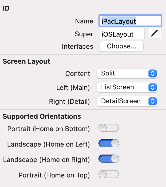
The Inspector for a Layout has two sections of importance: screen Layout and Supported Orientations.
The screen Layout setting allows you to specify the Content property, which determines how the display looks and works. There are three choices: screen, Split and Tabs.
Layout
A Layout have have several layouts styles, including just a single screen, a split of two screens and tabs for multiple screens.
Screen
By default, Content points to screen. This is the initial screen that will be displayed when the app launches, filling it entirely. You can change this to point to any screen that is in your project. New Screens can be displayed over this default screen by calling the PushTo method on screen. You can also use the MobileApplication.CurrentLayout property to change the initial screen.
Split
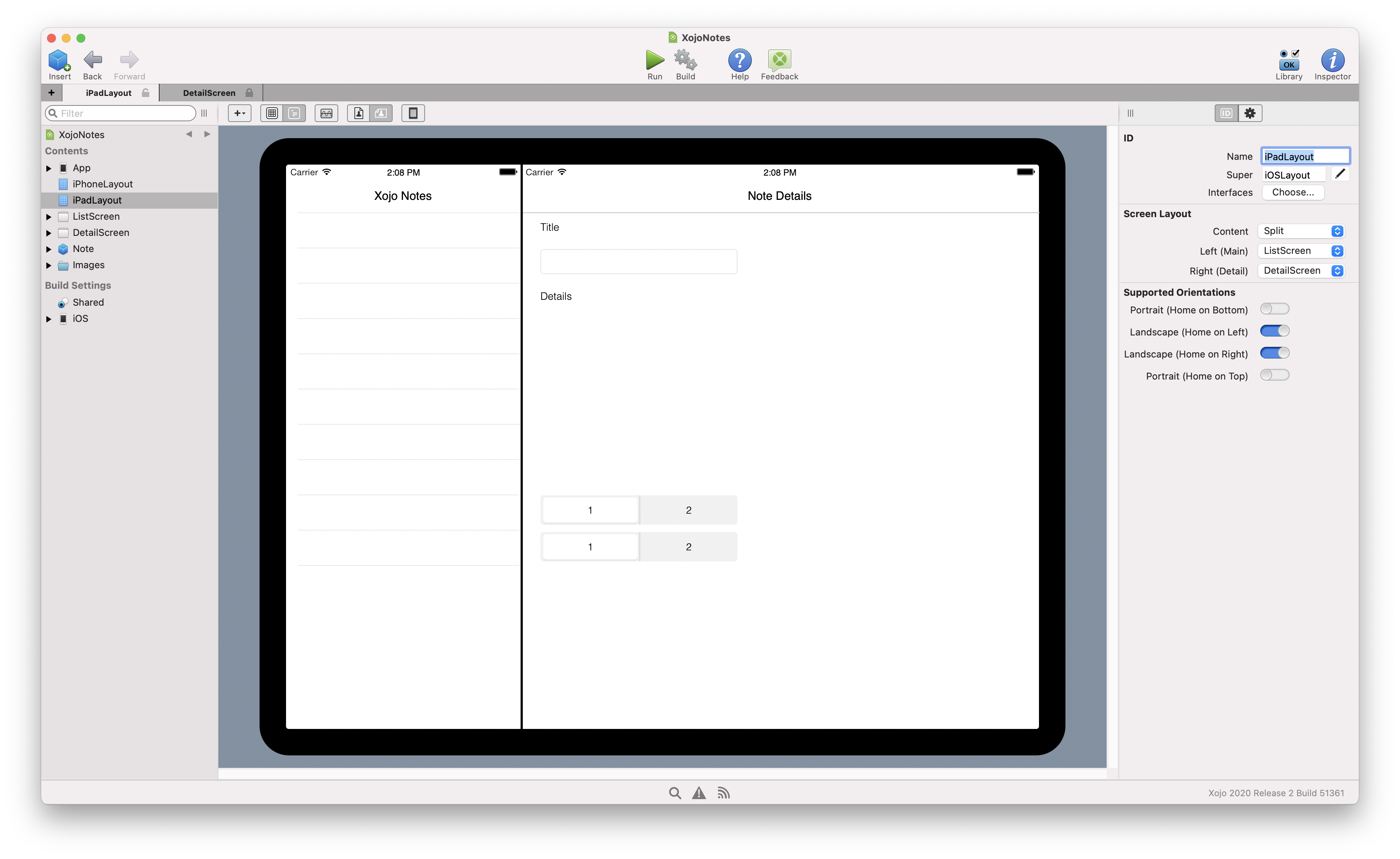
A Split layout allows you to split the layout into two sections: a master on the left and a detail on the right. Each of these sections is its own screen. This layout is only available on the iPadLayout used by iPad-sized devices. In landscape orientation, the master and detail appear on the layout at the same time.
In portrait orientation, only the details screen appears. Swipe from the left edge of the screen to the right to show the master screen.
The Xojo Notes app included with iOS is an example of a Split in action (when displayed in landscape orientation). It displays the email messages on the left and the selected message in the detail area on the right.
You can also have each section of a Split be a Tab for further granularity.
Tabs
Much like with a desktop app, the tabs layout allows you to have multiple screens that the user can select by using the tab control. In the case of iOS apps, the tab control is displayed at the bottom of the screen. For an example, the iOS Clock app uses tabs at the bottom to select the type of clock you want to use. Use the Edit button for the Tabs property to add or remove tabs, specifying their name or icon. Use the Tab Content property to specify the initial screen to display for each tab.
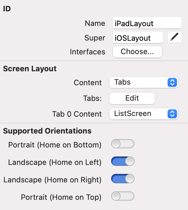
You need to click on each tab on the Layout to change the selected tab so that you can set the Tab Content property for it.
Supported orientations
You can control the types of orientations that are allowed using the Supported Orientation settings of the Inspector for the iPhone and iPad screens. There are four options:
Portrait (Home on Bottom)
Landscape (Home on Left)
Landscape (Home on Right)
Portrait (Home on Top)
By default, each of these settings is set to ON. If you want to disable an orientation for your app, set it to NO. For example, it is common for iPhone apps to have Portrait (Home on Top) disabled and many iPhone apps also have Landscape orientations disabled.
App multitasking
The iPad supports app multitasking which allows you to use more than one app at a time on the device. Your app automatically supports this if all the "Supported Orientations" are turned on. If you turn off any supported orientations, then your app cannot be used by iOS app multitasking.
Device rotation
When the user rotates the device to change its orientation, the Resized event handler on the currently displayed screen is called. In this event handler, you can check the size of the screen (using its Size method) to see if it is now in portrait or landscape. With this information, you can then decide to reposition controls or to display a completely different screen, allowing you to have one screen for portrait and one for landscape. To check if the screen is in landscape, check if the height is greater than the width:
If Self.Size.Height > Self.Size.Width Then
  ' Landscape
End If
To check if the screen is portrait, check if the height is less than the width:
If Self.Size.Height < Self.Size.Width Then
  ' Portrait
End If
If you not use any special processing, the auto-layout rules you have specified for the controls on the screen will adjust your controls. For example, a text field may expand to use more available width when a device is rotated from portrait to landscape.
Changing Screens at runtime
You can add additional layouts (in addition to the default iPhoneLayout and iPadLayout) to your project. You can then switch these screens to display at runtime by using the MobileApplication.CurrentLayout property like this:
Var s As New MySpecialLayout
App.CurrentLayout.Content = s.Content
When you do this the screen is immediately replaced and the screen hierarchy that is accessible with the Back button on the Navigation bar is lost.
See also
iOSLayout class; Mobile Screens topics