Inspector
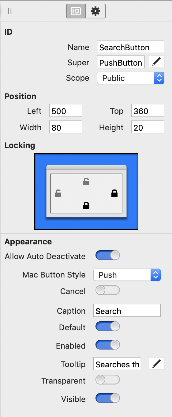
The Inspector displays information (properties) for the currently selected item. This could be properties of controls on a Layout Editor, project items in the Navigator, Build Settings or methods or properties when using the Code Editor.
The Inspector shares its space with the Library on the right side of the workspace, but you can also set a preference to have it display as a floating palette. To show the Inspector, click the Inspector button on the toolbar, select View > Inspector from the menu or press the shortcut key (⌘-I on macOS, Ctrl-I on Windows and Linux).
What you see in the Inspector depends on what you have selected. For controls in the Layout Editor, you will see all the properties available for selected control. These properties are grouped by topic to make it easy to find what you are looking for.
The Inspector may have more than one tab at the top depending on what is being viewed. More common items are contained in the "ID" tab and less commonly used (or advanced items) are in the "Gear" tab.
Changing properties
There are several different types of properties and values they can contain.
Numeric properties
If the property you want to set is numeric -- such as the Left, Top, Width or Height properties -- you can either enter a number of an expression that evaluates to a number.
To enter an expression, you can use the simple arithmetic operators: +, -, *, /, \ (integer division), % (mod) and ^ (exponentiation). You can also use parentheses to control the order of evaluation. Additionally you can use references to property values by name, allowing you to write expressions such as "Top*2" or "Width + Left".
If an expression is invalid on its own, the current value is prepended; this allows you to (for example) enter "*2" as a handy shortcut for doubling the current value when multiple objects are selected. You add a value to the current value, use "+ + value". For example, to add 10 use "+ + 10", since "+10" will be treated as just 10.
These expressions are only evaluated once when the control first appears on the layout. They are not evaluated again (should you reference another property by name that changes, for example).
Boolean properties
The values of Boolean properties are displayed as ON/OFF switches in the Inspector. A value of False is indicated by OFF and a value of True is indicated by ON.
You change the value by clicking on the switch to toggle it.
You can right-click on Boolean properties and choose Assign Constant from the contextual menu to assign a Boolean value using a constant from the project. The constant name should be prefixed with a "#". To edit or remove the constant, right-click on it and choose Assign Constant or Remove Constant from the contextual menu.
Text properties
Text properties are entered by typing into the Text Field in the Inspector. If the text you want to enter is long, you can click the Text icon to open a larger window with a Text Area.
Constants
You can use a constant as a value for a property. For example, you can create a constant that contains the caption for all the "Accept" buttons in your project. If you want to change the caption, you only need to change the value of the constant rather than edit the values for each button. This technique is also useful for localization.
A good place to create constants for this purpose is in a Module.
To use a constant for a property value, precede its name with "#" (pound sign). For example, if you want to use a global constant (in a module) named AcceptButtonText, you would refer to it in the Caption property of a button as "#AcceptButtonText".
Choosers
Some properties require you to choose a value from a fixed list, typically displayed as Pop-up Menus. Choose the value from the menu.
For controls that accept a picture as a property value, you can select the picture by choosing it from the chooser for the property (all pictures in the project are added to the list automatically). The last menu item of the list of pictures is "Browse", which allows you to select a picture from your drive to add to the project and use.
Color properties
Color properties display as the selected color. Click on the color to display a Color Picker window for choosing another color.
Multiple selection
When more than one item is selected, the Inspector displays only those properties common to all of the selected items. When you change a common property, it is changed for all the selected items.
Palettes
By default, the Library and Inspector display on the right side of the window and only one appears at a time. You can quickly toggle between the Library and Inspector using View > Toggle Palettes in the menu.
If you would prefer to position the Library and Inspector anywhere or have them both on screen at the same time, you should use the preference to display them as separate Palettes, which you can then position however you want (even a second display). In the General area of Preferences (Options on Windows and Linux) change "Show Library and Inspector" from "In the project window" to "As floating palettes".
See also
Navigator, Layout Editor, Library, Code Editor, Modules, Localization topics