Layout Editor
The Layout Editor is the primary editor you use to design the user interface for your app, whether it is a desktop, web or iOS app. In desktop apps, you use the Layout Editor to design your Windows and Container Controls. In web apps, you use the Layout Editor to design Web Pages, Container Controls and Web Dialogs. In iOS apps, you use the Layout Editor to design Views.
Layout area
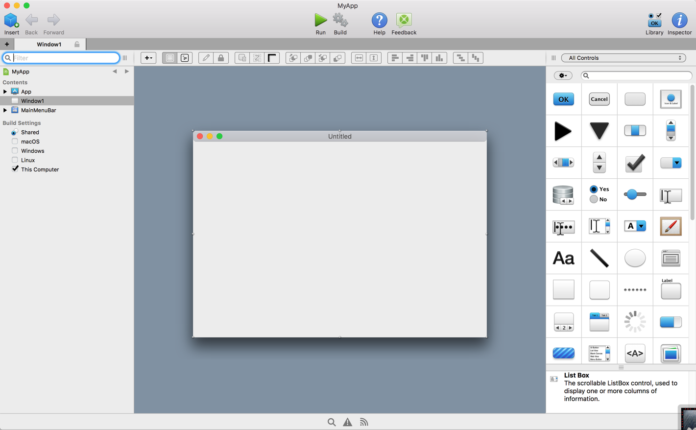
The Layout Area displays as either a window, web page or view, depending on the type of project. Regardless, you add controls to the area by dragging them from the Library or the Navigator onto the Layout Area.
You can drag controls around the layout editor to position them.
Hold down Option before dragging a control creates a duplicate control at the new location (the original control is unchanged).
You can drag some controls onto other controls in order to make one control the parent of a another control (control parenting). For example you may add a Tab Panel control to a layout and then drag a button onto it. The Tab Panel control now becomes the button's parent rather than the window itself. When you do this the parent control has a red outline around it, which you can control in the Layout Preferences. Other controls that make useful parents include the Group Box, Page Panel, Rectangle and the Canvas.
Command Bar
The Layout Editor has its own command bar (aka toolbar) with the following features, in order from left to right:

Add
The Add button is used to add code-related items to the layout. This includes:
Event Handler (refer to the Event Handlers topic below)
Menu Handler (desktop only)
Method
Note
Property
Computed Property
Constant
Delegate
Enumeration
Event Definition
External Method
Shared Computed Property
Shared Method
Shared Property
Structure
Using Clause
View Layout
This button is grouped with View Code and is a toggle. When viewing a Layout, this button is selected. When not viewing a layout, you can click this button to quickly switch back to the Layout Editor to see the layout for the last item you were working on.
View Code
This button is grouped with View Layout and is a toggle. When viewing a Layout, this button can be used to switch back to see the Code Editor for the last item being edited.
Set Default Value
The Set Default Value button allows you to set the default value for various controls. Refer to the Default Values topic below.
Lock Position
The Lock Position button is used to lock controls so that they cannot be moved by the mouse while editing the layout. You can still move the control using the arrow keys, change properties and delete it as necessary.
Show Tab Order
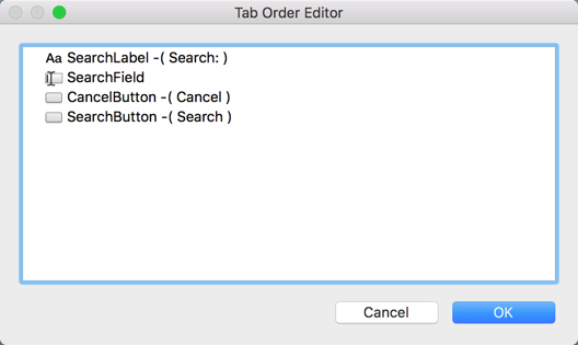
Available for Desktop and Web projects only. Show Tab Order displays each control in the Tab Order Editor. The controls on the layout appear in the editor list in tab order. You can drag controls around to change their tab order on the layout.
Auto-Adjust Tab Order
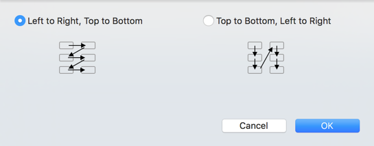
This item displays a dialog that will automatically adjust the tab order for the controls on the layout, which is faster than doing it manually. The choices are "Left to Right Top to Bottom" and "Top to Bottom Left to Right" with the flow indicated by the graphic in the dialog.
Show Measurements
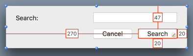
The Show Measurements button allows you to better visualize your layout. When you click enable Show Measurements view, you can move the mouse around your layout to see various measurements, such as how far a control is from the top of the layout or how far controls are from each other.
Select multiple controls to see various measurements, including distances between the controls.
Ordering
The Ordering buttons (Order Forward, Order Front, Order Backward and Order Back) are used to change the ordering of the controls on the layout.
Fill
The Fill Width and Fill Height buttons expand the selected control to fill the remaining space in its container.
Alignment
The Alignment buttons (Align Left, Align Right, Align Top and Align Bottom) are used to align controls on the layout with each other. Select all the controls you want to align and then choose one of the buttons to align them.
Spacing
The Space Horizontally and Space Vertically buttons align the selected controls so that they are spaced equally apart.
Light/Dark Mode Preview
On MacOS 10.14 and above, this button allows you to preview your window in light and dark modes.
Shelf
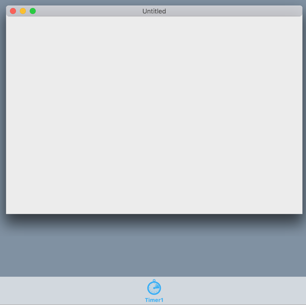
Some controls that are added to the layout are not actually a control on the layout, such as a Timer. When you add these types of controls to the layout, a Shelf is automatically displayed at the bottom of the Layout Editor and the control is added to it.
In web apps, Web Dialogs appear on the shelf.
In desktop apps, a toolbar added to a Window appears on the shelf.
Default values
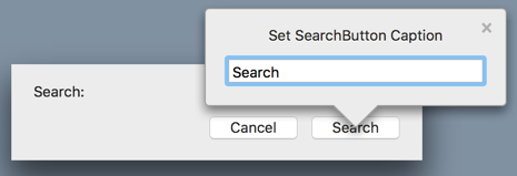
A control on the Layout Editor can have its default value specified by pressing Return while the control is selected, by clicking the Pencil rollover icon that appears when you move the mouse over a control, or by clicking the Set Default Value button on the Layout Editor Toolbar . This opens a popover window to enter the default value. For example, with a PushButton, you can specify the Caption. To close the pop-out window, click the small close icon, press Return, click outside the pop-out window or click the “Set Default Value” button on the Layout Editor toolbar.
Event handlers
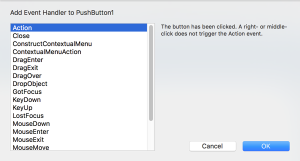
To add an Event Handler to your control, you click the Add button and select Event Handler.
This opens the Add Event Handler Dialog which displays the events that are available for the control (or the window, web pag` or view if that is what was selected). You can click on each event to view the description of the event. Select one or more events and click OK to create corresponding Event Handlers. You can also press ⌘ A (Ctrl A on Windows and Linux) to select all the Event Handlers to add at once.
You can add multiple events at once by selecting each of them and clicking OK.
Event Handlers appear in the Navigator underneath the selected control. You can click on an Event Handler to see its code in the Code Editor.
Alignment Guides
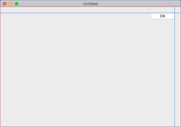
As you move controls around on a layout you will see alignment guides appear to help with positioning. The guides appear as you drag the control near the edges of the layout or other controls. They are a great way to make sure that controls are aligned to the same positions as other controls on the layout.
To disable the display of alignment guides, hold down Command while dragging (or Control on Windows and Linux).
User controls (control subclasses)
You can access user controls (subclasses of built-in controls) at the end of all the built-in controls in the Library. If you have turned on "Show Group Banners" for the Library, these controls appear in the Project Controls group of the Library.
Another option is to drag the subclass from the Navigator onto the Layout Area.
Working with controls on the layout
You can right-click on any control on the layout to display the contextual menu. From the contextual menu you have these options:
Item |
Description |
|---|---|
Add to |
Use this command to select Add Event Handler from the submenu to add event handlers to the control. |
Inspect |
Displays the Inspector for the control. |
Set Default Value |
Displays the Set Default Value popover for the control. |
Scope |
Changes the scope of the control. |
Cut/Copy |
Use to cut or copy the control. |
Paste |
Pastes a control in the clipboard onto the layout. |
Delete |
Deletes the control. To put it in the clipboard, use Cut. |
Duplicate |
Creates a copy of the control on the layout. You can also create a copy of a control by clicking on it with the mouse button and then holding Command (Shift+Control on Windows and Linux) while dragging the mouse. |
Find |
Does a Find using the control name with the results shown in the Find panel. |
Prints all the source code for the control. |
|
Extract String Constants |
Displays a dialog where you can create constants for use by Text properties on the selected controls. |
New Subclass |
Creates a new class in the Navigator that uses the control as its superclass. |
Select All |
Selects all the controls in the layout. |
Select |
This submenu contains all the controls on the layout. Use it to find and select a control by name or to select a control that it not visible in the layout due to layering. |
Lock/Unlock Position |
Locks the control at its position on the layout preventing it from being accidentally moved while editing the layout. To move the control, unlock it first. |
Edit Superclass |
If the control has a superclass, then this command takes you directly to the superclass so you can edit it. |