Changing the appearance of controls
The appearance of controls in a web app can be changed in two ways: for all controls in the project at once or for individual controls.
Changing all controls
Changing the appearance of all controls at once is done through the project's theme. Each Xojo web project has a theme which controls everything about the appearance of controls from size to font to colors, even some behavior. Xojo has a default theme but you can substitute other themes as well. Under the hood, Xojo uses as web technology called Bootstrap and thus the themes you can use in Xojo must be design for use with Bootstrap. Bootswatch is a website that provides many free Bootstrap themes that are Xojo-compatible.
On the Bootswatch website, clicking the Preview button for any theme will give you an idea of just how many different aspects web control appearance are governed by themes. Once you find a theme you like, click on the menu connected to the theme's download button and select the file titled bootstrap.min.css. That is the only file you need. To use it in your project, drop it into the project in the Navigator. The layout editor itself will even take on the theme as well.
There are many free themes available on the Internet. Some are more compatible with Xojo than others at the moment but those at Bootswatch are very compatible.
If the look of your web application needs to match a website, changing the theme is an easy way to do that. In fact, many websites use Bootstrap and can provide the Bootstrap theme file they are using.
Because themes can affect the size of controls, changing themes after you have laid out controls may require some adjustments.
Theme samples
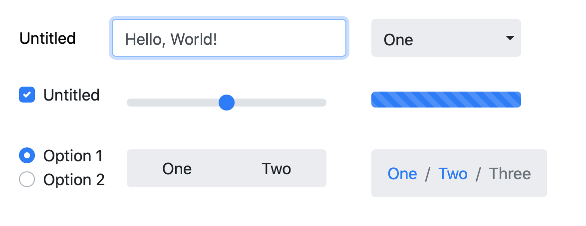
Here are some of the controls with the default theme:
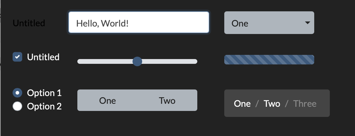
Here are the same controls with the Darkly theme:
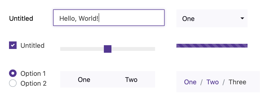
Here are the same controls with the Pulse theme:
Creating your own theme
You can create your own themes as well. Bootstrap Magic is one example of a free online editor.
Changing individual controls
Changing the appearance of individual controls is done through their Style property. This property allows you to change appearance properties such as ForegroundColor, BackgroundColor, BorderColor, BorderThickness, font, font size, font styles and opacity. All this is done in code.
Example
The example below, the first WebTextField is unchanged. Via changing it's Style property, the second WebTextField has the Opacity set to 80 (out of 100), the border thickness set to 3 and the border color set to Color:
The code for this (in this case in the WebTextField.Opening event, is straightforward:
Me.Style.Opacity = 80
Me.Style.BorderThickness = 3
Me.Style.BorderColor = Color.Blue
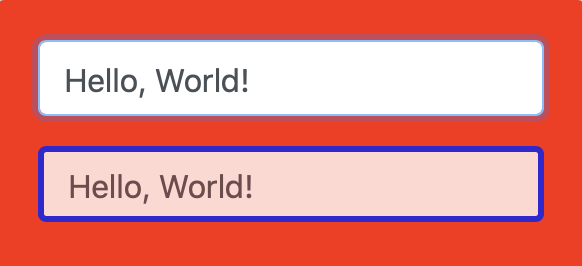
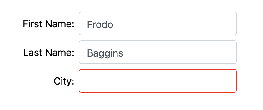
Changing a control's style can be a great way to indicate errors. For example, a the user has forgotten to fill in a mandatory field, setting its border color to red helps make clear which fields need to be completed:
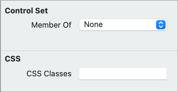
You can also change the look of individual controls by assigning Bootstrap CSS classes at design time via the advanced panel of the Inspector or at runtime via the CSSClasses method.
For example, assigning btn-close rounded-circle to the CSSClasses designtime-only property in the Inspector will make the button have a circular background when the mouse is hovering over it.

See also
WebStyle and WebCSSClasses classes, CSSClasses method